Red meat

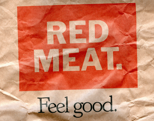
My friend is working on an installation that requires red. Red paper, red plastic, red fabric, red string, red found objects, red everything. As I come across them, I save items of red that might interest her, and when I have gathered a decent amount I hand it over. I delivered a bagful yesterday, and as she was rifling through it she pulled out this red meat paper bag, which, given the appeal of its straight talking and typographic qualities, I immediately asked to borrow back. After I have made use of it today I will return it, giving this piece of packaging more lifespan that it ever would have imagined for itself.

Blue bag

It’s remarkably easy to accumulate offcuts, scraps, printed bits and pieces and ephemera, all intended to be used later in some collage, artists’ book or other artwork. Each piece invariably holds some special appeal at the time, but later, going through those piles of saved precious commodities, the appeal of much of it can have evaporated. I have a busy year ahead, and I’m preparing for it by clearing space and assessing the material I need to keep and that which I need to discard or reassign. I find that I am discarding more than I am keeping, an enlightening process because it’s showing me how my art practice has changed and developed over the last year or so. I’m also finding things I had forgotten about—which are now providing new inspiration—and items like this blue post bag from Sweden, which must have contained a delivery of books bought online, that will go back into the pile to be reassessed at some future point in time.

Typesetting

I have some pre-digital Sydney Morning Herald lead type. I’m not exactly sure what I’m going to do with it, as I don’t have a printing press or even a type cabinet, so I suspect that a good proportion of it will go the way of most of the other Herald lead and get melted down. Once I can bear to part with it, that is. My dilemma is that it is body text, maybe 7pt or 8pt, so it’s fiddly to handle, not that you want to be handling it too much and breathing in the dust, and anyway, for my creative purposes I don’t need a lot, just a few pieces of each letter. The type came accompanied by this picture, which I can only assume is an illustrated snapshot of the Herald back in the day. I particularly like the press on the left, which looks very much like a Columbian Press. The Columbian Press, manufactured in Philadelphia in 1813, was the first press to be operated efficiently by levers, and was designed to allow a whole newspaper page to be printed in a single pull. The counterweight, in the form of a neoclassical eagle, sits balanced on the counterpoise lever. The scene depicted here looks rather relaxed, but perhaps it is a slow news day and they are nutting out the cryptic crossword.

The Tontine

Here is another of those book jackets I was given a while ago. This one appeals to me for its title script—which I’m guessing was done by the illustrator, Herbert Ryman—not only because of its obvious handwritten appearance, but it was published in 1955, long before the proliferation of script fonts. Thomas B Costain was a Canadian journalist, reporter, writer and editor who turned into a bestselling author of historical novels in his 50s. I was quite interested to read about Costain’s life and career, but Herbert Ryman proved even more engaging! He was an artist and illustrator whose considerable body of work includes watercolours of the Californian coast, the wonderful Ringling Brothers Circus posters, designs for attractions at the 1964 New York World’s Fair, and a long association with Walt Disney. He art directed Fantasia and other animated features and drew the first illustrations of the theme park that become Disneyland.