Dump no waste

dumpfish[c]alphabetcitypress

This notice is etched into the sidewalk in Honolulu’s Chinatown. I’m not sure if the fish is cheerfully oblivious, still swimming around in pristine waters, or if it has already swallowed a mouthful of waste, and is a warning to passers-by that this is the fate that awaits a fish if the oceans are polluted. With its bee-sting lips and googly eyes, it could easily be cousin to the fish that Bart pulls out of the water downstream from Monty Burns’s nuclear plant. Or is it just a happy carp?

Earth

concise[c]alphabetcitypress

This week I went to see Earth Platinum at the State Library. Earth Platinum is the largest atlas in the world: 128 pages, 150 kilos and measuring 1.8 x 1.4 metres closed. The Earth books are the brainchild of Millennium House publisher Gordon Cheers. Through my association with Millennium House as a designer on many of their books, I followed the trials and tribulations of Earth during its production, but seeing it in the flesh was something else. It was open at Europe, and I desperately wanted to turn the page and look at more. I have a copy of Earth Concise, which is a mighty book in itself. At 576 pages and measuring 410 x 315 mm it is only concise in relative terms, but at least I can lift it and it does fit (albeit sideways) on my bookshelf!

DF Moderns

modernchilli[c]alphabetcitypress

Today’s Google Doodle celebrates the birthday of Wilbur Lincoln Scoville, the pharmacist who gives his name to the Scoville scale—the scale that measures the hotness of chillies. The thought of hot chilli peppers immediately brought DF Moderns to mind! The Moderns font, designed by David Sagorski, is a collection of dingbats inspired by twentieth century modern art—notably Picasso and Kandinsky—and published by Letraset in 1994. Sagorski’s other fonts include Expressions, Mo Funky Fresh, Bang and Faithful Fly.

Altemus

altemus[c]alphabetcitypress

The Altemus Collection is the work of Robert Altemus, a New York-based designer. It contains around 8000 ornamental and dingbat designs across thirty font families. As well as the character sets you might expect, like Altemus Dingbats and Altemus Borders, there is a slew of alluring others: Birds, Suns, Spirals, Roughcuts, Rays, Pinwheels, Leaves, Kitchen, Toolkit, Pointers and Bursts. Altemus was influenced from everything from Brazilian art deco architecture and 1950s fabric designs to decorative elements found on old packaging at flea markets. What I find so impressive is that the elements of the collection are original, drawn from scratch before being worked up into vector format.

King of Hawaii

kinghawaii[c]alphabetcitypress

Regardless of any political conservatism, King Kalakaua, last reigning king of the Kingdom of Hawai‘i, seems to have left his mark in ways that matter—dancing, storytelling, surfing and music! He revived hula and surfing; his support of the ukulele contributed to its becoming the musical instrument symbolic of Hawaii; he wrote the lyrics to Hawai‘i Pono‘i, which became the Hawaiian state song. Not long after his reign began, in an attempt to boost a struggling economy, he negotiated a treaty with President Ulysses S Grant which allowed certain Hawaiian goods to be admitted to the United States tax-free. I don’t know if ‘fancy sliced’ pineapple was part of the deal, but this old packaging box features him prominently. It goes without saying that I like the typography, but I especially like his portrait—or is that Magnum, PI?

Beach weather

beachbabe[c]alphabetcitypress

The torrential Sydney rain has finally stopped and it’s looking more like beach weather. If ever I need to know the weather forecast, experience has proved that the most reliable method is to call my friend in Geelong. Whatever weather she is experiencing on that particular day is the weather we will have in Sydney the next. It’s uncannily accurate—more so than conventional weather reports. Regardless, I’m in an airconditioned office today so will not be needing the suntan lotion, and no, that’s not her in the picture.

Letraset

letrasetgill[c]alphabetcitypress

Although Letraset is the name of a UK-based company that has been making products for the graphic design industry since 1959, the word ‘letraset’ (at least to designers) has joined the ranks of hoover, thermos, dry ice, cellophane, escalator, videotape, velcro, astroturf, esky, biro, bubble wrap, hills hoist, hula hoop and google—by acquiring generic word status. Whoever says ‘I’m going to apply a dry-transfer rubdown using a purpose-made burnishing tool and this sheet of Helvetica 24pt decals’! Although actually, in this digital age of desktop publishing, not many people would letraset it either. Letrasetting is deceptive in the level of skill required to execute it well. I have evidence of this—a record cover I designed early in my career has a slightly crooked R in the title, which jumps out at me accusingly every time I see it.

Tree

tree[c]alphabetcitypress

I don’t know how we function without labelling everything! More so, I am also amazed at how a simple word can impart so much information—this hinged metal square set in concrete is obviously not a tree, but it conveys much about inner city landscape planning and management in relation to the tree close by. And I quite like that speckled pink terrazzo.

Encyclopaedia Britannica

britannica{c}alphabetcitypress

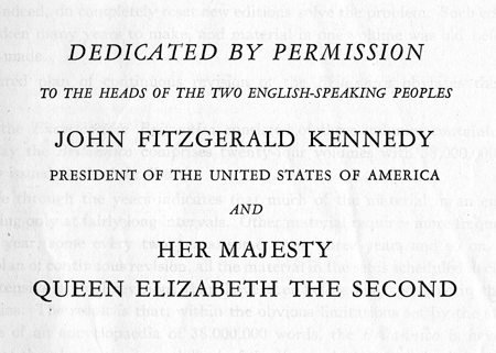
Encyclopaedia Britannica was founded in 1768 and the first edition was published as three volumes. The last printed edition was published in 2010, and it had grown to 32 volumes, 32 640 pages, with almost 4500 contributors (including Nobel prize winners and American presidents) and about 100 editors. When I was quite young my family procured a set of encyclopedias, bought second-hand from I don’t know where, an already well-used 14th edition 24-volume set published in 1962. I used it often and with great enjoyment (they were books after all!) but once I finished school those stuffy pages held little interest for me. Until recently, that is, when my family wanted to get rid of it, and I thought it would make excellent fodder for book art re-purposing. To my surprise I am finding that it holds almost more interest now than it did then. The publisher was William Benton—a Minnesota-born (on 1 April 1900, how wonderful!), Yale-educated, Connecticut senator—and Harry S Ashmore, the editor-in-chief, was a Pulitzer prize winner. The departmental editors and advisors is a staggeringly impressive list of highly educated people, and as I flick through the pages of Volume 1 (A to Annoy) I find information about Absolute Pitch, Aero Engines, Alaska, Amarillo, Andromeda and Anhydride—with a sense of discovery and surprise that doesn’t come from looking stuff up on Wikipedia. No doubt these volumes will end up reconfigured, cut up, folded, papier mached, rebound and restructured, but perhaps I will enjoy them for a while longer as the books they are. And perhaps I will keep this dedication page.