The letter G

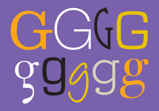
The letter G is the seventh letter and fifth consonant of our alphabet, and evolves from the Phoenician gimel and the Greek gamma. G is a guttural consonant, articulated in the back of the mouth or throat. It can sound hard (a velar plosive, where the back of the tongue comes in contact with the soft palate)—guard, Garamond, guts, glue; or soft (a velar nasal)—sing, gin, danger, ginger; or even silent!—gnat, gnome, design, diaphragm. The lowercase g is typographically rich, with single-storey and double-storey variants, bowls, ears, loops, tails and ears.

Airwell

I was tagging along for the ride. It was a hot day, and when we reached our destination I decided to stay in the car for the short time that was needed for the errand to be run. Maybe it was the heat that drew my attention to the airconditioning units, maybe it was the total uninterestingness of the car park in general, maybe I was staring into space. Whatever the reason, my eyes landed on the aircon badging, and curiosity about the typography has led me to discover that the company started up in the 1940s, and while I’m sure the logo has been modified over the years, it still retains an air of retro.

DF Diversions

There’s a summer heatwave here. Yes, I know, it’s summer and it’s Australia, so saying it’s hot is somewhat tautological. But really, it’s been hot. Last Sunday the weather app on my phone (it’s addictive, isn’t it?) told me the temperature was 45 degrees. I have an OCD tendency to want to know the temperature in fahrenheit too. A quick calculation using the ‘add 15 and double it’ formula made it a staggering 120 degrees. (More accurately it translates to 113, but either way, when it gets that hot what’s a few degrees either way?) News reports of hordes of people at the beach proved the point and I bet the cinemas were packed too, given how icy their airconditioning usually is. We stayed inside all day in a dark room with the fan on, but perhaps we should have ventured to the beach, which this dingbat, from the DF Diversions character set, makes enticing.

Hypnopaedia

Hypnopaedia was designed by Zuzana Licko of Emigre in 1997. The character set comprises 140 patterns, each of which is made up of a single letter rotated and interlocked, resulting in an abstract, ornamental illustration. I learnt something new today. Hypnopaedia is not just the name of a typeface—it is the name for sleep learning, or learning by hearing while asleep or under hypnosis. Perhaps I’ll have a siesta …