TT Corals is one of my favourite typefaces at the moment. It has an extensive array of weights—thin, light, regular, bold, extra bold, and black—that combine and complement each other well. TT Corals is a modern humanist sans serif typeface, designed in 2016 by the Russian-based TypeType team. I like it because it is easy to read as well as being stylish, putting it in the good company of typefaces like Meta and Freight Sans.
Green bird
Everyone knows that it is important to have ecological and environmental awareness and responsibility, yet every day we encounter a mess of packaging that is an eyesore and an assault on our aesthetic sensibilities and quality of visual life. Here’s an example of what I consider to be a much more clever and sensitive way of getting a message across. Brown paper packaging, simple one-colour printing, and using a recognised symbol as part of the illustration—resulting in a serious message delivered with lightness. In fact I kept the packaging and brought it home half way around the world in order to re-use it in some way! I’m momigami-ing it and using it in my next artists’ book.
The Beautiful is Vanished
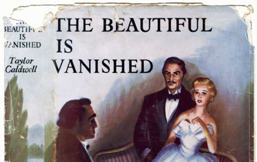
Wow, Taylor Caldwell was prolific! She wrote as Taylor Caldwell, Marcus Holland, Max Reiner and J Miriam Reback! She published more than 60 historical and religious-themed novels. Her first novel, The Romance of Atlantis, was written when she was 12, and was published about 60 years later. Her stories have been praised for being intricate and suspenseful, and there is even a Taylor Caldwell Appreciation Society. But it seems that not everyone approved of her career choice. Her father sent her to work in a bindery as a more suitable activity; in the 1930s there was a public stir when it became known that ‘Taylor Caldwell’ was not a man, as was presumed; and in the 1940s Time magazine reported that her husband burned 140 of her unpublished manuscripts. Seems nothing could stop her writing, though, and good for her! Despite all this it’s the book jacket I like. This one dates from 1951—dramatic illustration, hand-crafted typography.
F Neural
Here’s a typeface I’d love to find a use for. It came with FUSE 1–20, the 2012 anthology of the FUSE project, an experimental publication on typography and fonts launched by Neville Brody and Jon Wozencroft in 1990. The original FUSE was a quarterly ‘magazine’ published by FontShop. Each issue was thematic and contained a floppy disk (!) with fonts, plus posters, in a cardboard carton. I can’t find any information that tells me who designed F Neural, or when, but I am impressed by its inventiveness, and how well-crafted it is despite its deconstructed appearance.