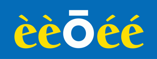
A diacritical mark is a sign that is written above or below a letter to indicate a difference in pronunciation, tone or stress from the same letter when unmarked. Umlauts, macrons, cedillas, dots, breves, accents and graves are examples of diacritical marks. Whether it’s because I didn’t learn French at school, or because I have a tendency to confuse left and right, I get accents and graves mixed up. I know that one goes to the left and one goes to the right, and that they appear above vowels, but I don’t actually know how or when to use them. If I ever have to type the word cafe, for example, I either leave the mark off altogether, because the word is still recognisable, or rely on the spellchecker! Macrons (a horizontal line above the letter) and umlauts (the double dot) don’t cause me nearly as much angst.
Eames Frames
Eames Century Modern is a font family of eighteen weights from House Industries. It is a slab serif with smooth brackets, a style known as Clarendon but also sometimes referred to as Ionic. The family contains stencil, bold, regular, book, light and thin weights. It is a beautiful typeface, but what really catches my eye and makes it a standout are the extras, particularly Eames Frames, which I like just for their own sake.
Monday
It’s Monday, which means it is blog day, and this week I find myself devoid of inspiration. I’m currently working on several major projects that, even though they are progressing apace, are at a stage where they’re forming a major confluence in my headspace, and there’s just no room for anything else. Despite the fact that all these projects involve aspects of typography, I’m finding it difficult to drag my thoughts clear enough away. But yes—it’s obvious: a typeface called Monday! There is a particularly lovely serif typeface, with several weights, designed by Henrik Kubel of London-based A2-Type, but I don’t have it to use. I do have the Monday you see here, an internet font which I doubt I will ever use. I have Lemon Tuesday too, which I am also including because I’m running late and it’s almost tomorrow.
Shopping bags
Shopping bags are wonderful things. They come in a myriad of shapes and sizes, they are plain or patterned, and useful for many purposes. I am not the only one who likes them: I have seen whole exhibitions dedicated to their design, function and aesthetic appeal. These days there are fewer disposable plastic bags around, and an abundance of multi-use bags made from that weird polypropylene material (it’s still plastic). (Of course, now more people buy plastic bin liners instead of using the bag their groceries came in!) Here is a plastic bag I haven’t been able to part with. I already know that I won’t throw it away, but I haven’t found the right use for it yet. It’s not the plastic-ness I like, though: it’s the logo! I like the handwritten style, the simple line, the self-containment, the black and white.
Legacy Serif
I’m reading a book which has been set in Legacy Serif. I’m enjoying the book, one that caught my eye at the library by an author I have previously not had the pleasure of reading. The book cover is an unfussy design, with simple, elegant typography, which is the kind of book that my hand automatically picks up when I am making choices about my reading matter for the next three weeks or so. I have no doubt mentioned this before, but I love the library. It allows me access to more books than I could possibly afford to buy; when I find a writer I like I can go back for more; if I borrow a book that doesn’t grab me I can return it without having to suffer it all the way to the bitter end; and I don’t have to store books at home that I will only ever read once. My current book is published by Bloomsbury, who, to my great pleasure and approval, include a note about the type on the back page. The choice of Legacy Serif in this case is perfect, enhancing the joy of reading without detracting from the writing itself. Legacy Serif was designed by Ronald Arnholm in 1992.