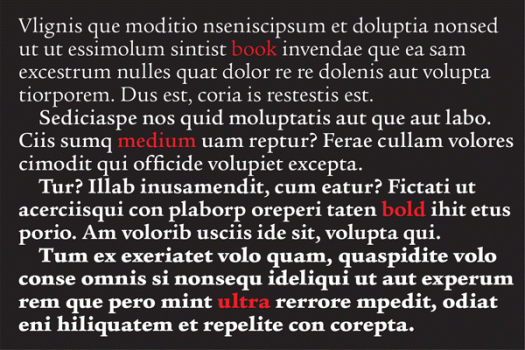
I’m reading a book which has been set in Legacy Serif. I’m enjoying the book, one that caught my eye at the library by an author I have previously not had the pleasure of reading. The book cover is an unfussy design, with simple, elegant typography, which is the kind of book that my hand automatically picks up when I am making choices about my reading matter for the next three weeks or so. I have no doubt mentioned this before, but I love the library. It allows me access to more books than I could possibly afford to buy; when I find a writer I like I can go back for more; if I borrow a book that doesn’t grab me I can return it without having to suffer it all the way to the bitter end; and I don’t have to store books at home that I will only ever read once. My current book is published by Bloomsbury, who, to my great pleasure and approval, include a note about the type on the back page. The choice of Legacy Serif in this case is perfect, enhancing the joy of reading without detracting from the writing itself. Legacy Serif was designed by Ronald Arnholm in 1992.

books • prints • typography • design
