Eames Century Modern is a font family of eighteen weights from House Industries. It is a slab serif with smooth brackets, a style known as Clarendon but also sometimes referred to as Ionic. The family contains stencil, bold, regular, book, light and thin weights. It is a beautiful typeface, but what really catches my eye and makes it a standout are the extras, particularly Eames Frames, which I like just for their own sake.
Monday
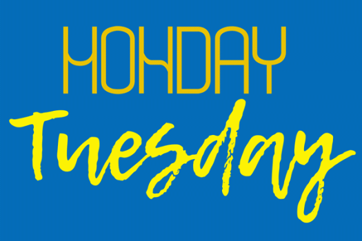
It’s Monday, which means it is blog day, and this week I find myself devoid of inspiration. I’m currently working on several major projects that, even though they are progressing apace, are at a stage where they’re forming a major confluence in my headspace, and there’s just no room for anything else. Despite the fact that all these projects involve aspects of typography, I’m finding it difficult to drag my thoughts clear enough away. But yes—it’s obvious: a typeface called Monday! There is a particularly lovely serif typeface, with several weights, designed by Henrik Kubel of London-based A2-Type, but I don’t have it to use. I do have the Monday you see here, an internet font which I doubt I will ever use. I have Lemon Tuesday too, which I am also including because I’m running late and it’s almost tomorrow.
Legacy Serif
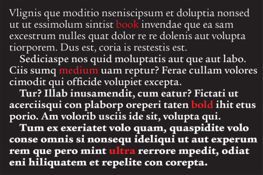
I’m reading a book which has been set in Legacy Serif. I’m enjoying the book, one that caught my eye at the library by an author I have previously not had the pleasure of reading. The book cover is an unfussy design, with simple, elegant typography, which is the kind of book that my hand automatically picks up when I am making choices about my reading matter for the next three weeks or so. I have no doubt mentioned this before, but I love the library. It allows me access to more books than I could possibly afford to buy; when I find a writer I like I can go back for more; if I borrow a book that doesn’t grab me I can return it without having to suffer it all the way to the bitter end; and I don’t have to store books at home that I will only ever read once. My current book is published by Bloomsbury, who, to my great pleasure and approval, include a note about the type on the back page. The choice of Legacy Serif in this case is perfect, enhancing the joy of reading without detracting from the writing itself. Legacy Serif was designed by Ronald Arnholm in 1992.
TT Corals
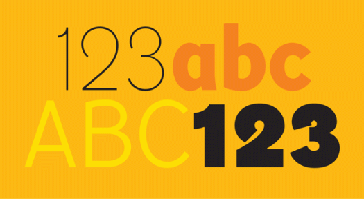
TT Corals is one of my favourite typefaces at the moment. It has an extensive array of weights—thin, light, regular, bold, extra bold, and black—that combine and complement each other well. TT Corals is a modern humanist sans serif typeface, designed in 2016 by the Russian-based TypeType team. I like it because it is easy to read as well as being stylish, putting it in the good company of typefaces like Meta and Freight Sans.
F Neural
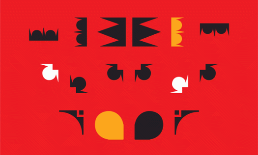
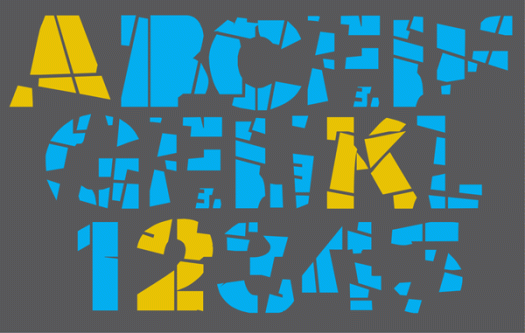
Here’s a typeface I’d love to find a use for. It came with FUSE 1–20, the 2012 anthology of the FUSE project, an experimental publication on typography and fonts launched by Neville Brody and Jon Wozencroft in 1990. The original FUSE was a quarterly ‘magazine’ published by FontShop. Each issue was thematic and contained a floppy disk (!) with fonts, plus posters, in a cardboard carton. I can’t find any information that tells me who designed F Neural, or when, but I am impressed by its inventiveness, and how well-crafted it is despite its deconstructed appearance.
DF Diversions
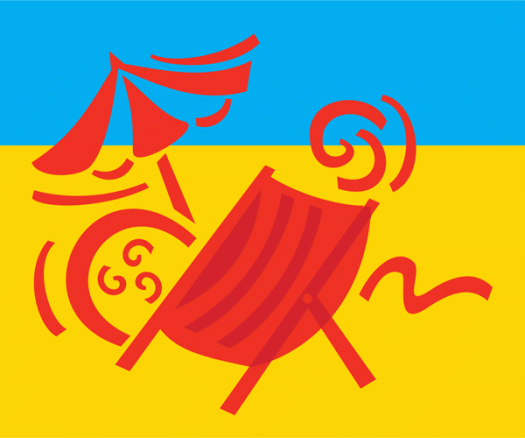
There’s a summer heatwave here. Yes, I know, it’s summer and it’s Australia, so saying it’s hot is somewhat tautological. But really, it’s been hot. Last Sunday the weather app on my phone (it’s addictive, isn’t it?) told me the temperature was 45 degrees. I have an OCD tendency to want to know the temperature in fahrenheit too. A quick calculation using the ‘add 15 and double it’ formula made it a staggering 120 degrees. (More accurately it translates to 113, but either way, when it gets that hot what’s a few degrees either way?) News reports of hordes of people at the beach proved the point and I bet the cinemas were packed too, given how icy their airconditioning usually is. We stayed inside all day in a dark room with the fan on, but perhaps we should have ventured to the beach, which this dingbat, from the DF Diversions character set, makes enticing.
Hypnopaedia
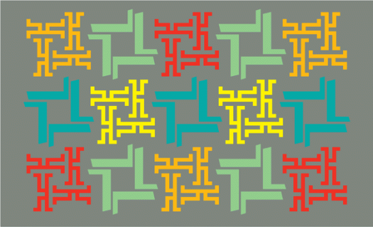
Hypnopaedia was designed by Zuzana Licko of Emigre in 1997. The character set comprises 140 patterns, each of which is made up of a single letter rotated and interlocked, resulting in an abstract, ornamental illustration. I learnt something new today. Hypnopaedia is not just the name of a typeface—it is the name for sleep learning, or learning by hearing while asleep or under hypnosis. Perhaps I’ll have a siesta …
Hibiscus
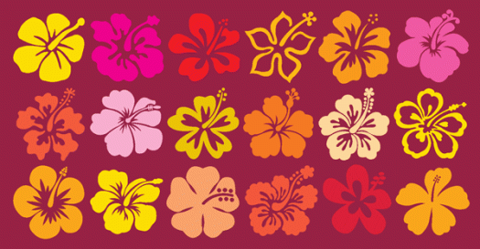
I have spent a lot of time in the garden this week. On Wednesday morning I woke with a plan. This entailed visiting several garden centres because, naturally, one place had the right pots, another had the right potting mix, and yet another had the right plants. On Thursday pots were positioned, plants were planted. On Friday, after months of dry weather, and with perfect timing, it rained. My new hibiscus already has new flowers, and wouldn’t you know it, I have a typeface called Hibiscus!
I’ll be back
Alphabet City Press is taking a short break, but I’ll be back. I am not an android assassin who has been denied entry into a police station, and therefore I will not be returning by driving a car through the doors to gain access. My return will be a little quieter—just the usual thing that will no doubt involve typography in some way. In the meantime, the DF Commercials clock and the wonderful Bach Script, a recent release from the Mendoza Vergara design studio, will have to suffice.
Z is for Zennor
Zennor was designed by Phill Grimshaw in 1995. Grimshaw studied at Bolton College of Art before earning a place at the London Royal College of Art in the early 1970s. He subsequently specialised in type design, returning to Lancashire where he established a commercial lettering studio. Grimshaw was prolific: he created dozens of dynamic, calligraphic-inspired typefaces, including Arriba, Braganza, Kendo, Scriptease, Tempus Sans, Pristina and Grimshaw Hand. In turn, his calligraphic work was inspired by typography, and his experimental crossover technique earned him a formidable reputation. His 1992 typeface, Hazel, became the last type design to be produced by Letraset as a dry transfer.

![illbeback[c]alphabetcitypress](https://alphabetcitypress.com/wp-content/uploads/2016/10/illbeback.gif?w=525)
![zennor[c]alphabetcitypress](https://alphabetcitypress.com/wp-content/uploads/2016/07/zennor.gif?w=525)