Awful Futura, fabulous Futura. I will use almost any other typeface before I will resort to Futura! It is over-used, ill-used, thoughtlessly used. And yet its alphabet contains some perfect letter forms and when used appropriately and wisely it is stylish beyond measure. It elicits such a reaction from me because I have had to use it too often, particularly in school textbooks where the ‘a’ most closely matches the ‘a’ of the Foundation Style method that’s used to teach kids to write. Upper case Futura looks great and lower case works well for headings, but to me it reads badly as body text, and therein lies the rub.
Concrete
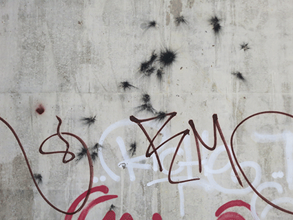
People have been writing on walls and scratching surfaces for centuries. When graffiti is done well it can be pretty interesting and a valid and creative art form. I’ve seen some great examples, and our urban environment can certainly be enriched by graffiti art. But so often the graffiti you see day to day is really ordinary and merely vandalism. I don’t think this piece of graffiti is anything great, but what I do like is how it works with the textures in the concrete pillar. I don’t know if the black splodges are related to the tagging, but it’s the combination of squiggle, splodge, concrete and colour that caught my eye.
Power station
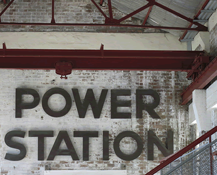
This sign, nothing to do with Robert Palmer, is inside the Balmain Power Station pump house building. The power station operated from around 1909 until it was decommissioned in 1976. In its day it supplied electricity to Balmain, Leichhardt, Ashfield, Newtown and Petersham, which is pretty amazing when all we can see today is an old brick shell with a bit of scaffolding to hold it up and a great old sign. The letters are copper and were salvaged when the power station itself was demolished.
Clarendon
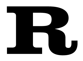
I love Clarendon Bold. According to Jaspert’s Dictionary of Typefaces it was originally put out in 1845 by Robert Besley & Co (formerly the Fann Street Foundry) as a heavy face to accompany an ordinary roman in dictionaries and the like. I like slab serifs generally, but I like Clarendon particularly well, especially the upper case R, which exudes boldness and solidity and gutsiness while simultaneously showing off a touch of quirkiness. Clarendon shouts look at me, I am not ordinary, which I guess is why it was perfect for those American Wild West Wanted posters. Clarendon is not a typeface I use very often, but it is striking and worthy and I am pleased to have made its acquaintance.


![callbox[c]alphabetcitypress](https://alphabetcitypress.com/wp-content/uploads/2012/10/callbox1.gif?w=525)