Here is another photograph from my book Type Town. Pictured is one of two W MacFarlane Furniture buildings. This one, the larger of the two, is in Westbourne Street, Petersham. The second is across the street on the corner of Charles Street. Both display similar signage, complete with thistles on matching curved pediments.
Rosella
Ghost signs are the faded remnants of old hand-painted advertising signs. You usually see them on the side brick wall of a building. Sometimes the state of their preservation is quite remarkable, and the sign is clear and legible. Other times just a hint of worn and weathered lettering remains. This one was uncovered by a restaurant in Cabarita when they removed some tiles in the process of renovating. It is from an advertisement for Rosella, best known for its tomato soup and tomato sauce, and while I can’t make out much of the text, I can clearly see the trademark bird and appreciate the beautiful patina.
Duke
I’ve seen this pub sign many times before, but on Saturday evening, when my friends and I, replete from a delicious and satisfying dinner, emerged from the chatter and clatter of the restaurant into the buzz and hum of Enmore Road, the drama of the scene caught my attention. The large freestanding letters against the sombre backdrop that swallows up the green light exude a noirish atmosphere that reminds me of Edward Hopper’s painting, Nighthawks, and for a moment, in my imagination, I was transported to that diner.
Glebe
I’m usually pretty lucky with parking, but last week I attempted to park in the Broadway carpark at lunchtime, when the novelty of the newly opened food court has obviously not worn off. It’s never the easiest time, but this was the first occasion when I drove round and round, all the way to the top, then round and round, all the way to the exit, without once seeing a vacant spot. Even street parking proved difficult so I had to park some distance away from my destination. The upside, apart from some enforced exercise, was finding a spot next to this exuberant lettering.
Arts till 10 pm
I realise this is not the full story, however when I saw this segment of writing I wasn’t particularly interested in finding out what the rest of it said. It was enough to occupy my time musing about why arts had a curfew, what it must have done that would result in not being allowed after 10pm. I am reminded of another cut off word, one that I see regularly when traversing the Petersham intersection. From the car, waiting for the lights to change, you can see a sign that shouts READ—which we should all be encouraged to do more of!—and it’s only when the lights turn green and you drive on that a hidden B is revealed.
Ghostwriting
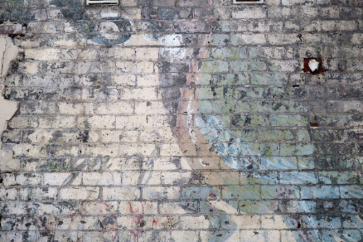
There’s a building in my neighbourhood, an old corner store, that has some particularly nice ghost signage above the front door, but today I was walking by rather than driving and was rewarded with this side view. It’s more subtle, more complex, more painterly and printmakerly than the more obvious front door sign. It’s hard to make out all the words here, but there’s a ‘choo’, which, in conjunction with the ‘first grade’ below it, most likely makes it a painted advertisement for Lan-choo tea.
Taxi
To my eye, this is an interesting collection of type and textures. I especially like the horizontal red slats butting up against the concrete pillar with its worn and weathered paint. Bar 35 is reputedly home to ‘incredible gourmet fusion pizzas’ (I haven’t tried them) and a choice of 200 beers from twenty countries. Perhaps that’s why there is a sign for taxis right next door.
Chemist
It’s been a while since I walked up Bathurst Street in the city, and this group of type styles, between Castlereagh and Pitt, reminds me that I’m well overdue for another walk through town. My attention was first drawn by the flag-like chemist sign. The H and M are missing on this side but there is no loss of legibility as the symmetrical sans serif upper case letters—which look like Helvetica Black—can be easily read in reverse. Half hidden behind the E is the original building mark, and it almost goes without saying that where there is an accessible bit of wall, there is graffiti.
Bill Posters
I know it’s old, but I still allow myself to wonder what poor old Bill Posters did to deserve prosecution. Not only that, but to have notification of his fate emblazoned over walls, telegraph poles and hoardings! As a kid, I really did want to know who this mystery Bill Posters was—and my mother, with her unalloyed delight in wordplay, did nothing to dissuade me of my misconception. Years later, the caution is still being publicised, and although I now know what it means, it’s still good to see that Bill Posters will be vindicated.
Neon P
I can hardly bring myself to admit it, but I fear that this establishment has become a shadow of its former self. It was more than a cafe: it was an institution. A trip to Melbourne did not go by without calling in at least once for what was guaranteed to be the best coffee and the best spaghetti marinara in that fine city. Sadly, on my last visit, I was bitterly disappointed on both counts. However the neon lettering in the side laneway remains as character-filled as ever—no pun intended—so perhaps I will be enticed in once again, just for old times’ sake.


![duke[c]alphabetcitypress](https://alphabetcitypress.com/wp-content/uploads/2016/09/duke.gif?w=525)
![glebe[c]alphabetcitypress](https://alphabetcitypress.com/wp-content/uploads/2016/08/glebe.gif?w=525)
![artstill10[c]alphabetcitypress](https://alphabetcitypress.com/wp-content/uploads/2016/08/artstill10.gif?w=525)
![ghostsign[c]alphabetcitypress](https://alphabetcitypress.com/wp-content/uploads/2016/08/ghostsign.gif?w=525)
![taxi[c]alphabetcitypress](https://alphabetcitypress.com/wp-content/uploads/2016/01/taxi.gif?w=525)
![chemist[c]alphabetcitypress](https://alphabetcitypress.com/wp-content/uploads/2015/01/chemist.gif?w=525)
![billposters[c]alphabetcitypress](https://alphabetcitypress.com/wp-content/uploads/2014/12/billposters.gif?w=525)
![neonP[c]alphabetcitypress](https://alphabetcitypress.com/wp-content/uploads/2014/07/neonp.gif?w=525)