Shopping bags

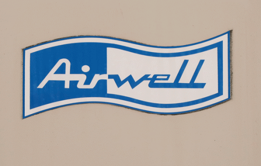
Shopping bags are wonderful things. They come in a myriad of shapes and sizes, they are plain or patterned, and useful for many purposes. I am not the only one who likes them: I have seen whole exhibitions dedicated to their design, function and aesthetic appeal. These days there are fewer disposable plastic bags around, and an abundance of multi-use bags made from that weird polypropylene material (it’s still plastic). (Of course, now more people buy plastic bin liners instead of using the bag their groceries came in!) Here is a plastic bag I haven’t been able to part with. I already know that I won’t throw it away, but I haven’t found the right use for it yet. It’s not the plastic-ness I like, though: it’s the logo! I like the handwritten style, the simple line, the self-containment, the black and white.

Champagne

This box is so ordinary I don’t quite know what to make of it. I have no objection to its plain appearance—it’s just that every other box at the bottle shop is more elaborate, usually designed to match, or at least echo, the labels on the wine bottles it contains. Perhaps that’s the point! Champagne should speak for itself. Perhaps it is just so très French: mon dieu, we do not have to prove anything to you/sell you anything/make any effort/être français est assez! Whether or not irony was intended, the box was different enough that it stood out from the shouting and competing crowd: paradoxically making the very unremarkableness of it remarkable.

F Neural

Here’s a typeface I’d love to find a use for. It came with FUSE 1–20, the 2012 anthology of the FUSE project, an experimental publication on typography and fonts launched by Neville Brody and Jon Wozencroft in 1990. The original FUSE was a quarterly ‘magazine’ published by FontShop. Each issue was thematic and contained a floppy disk (!) with fonts, plus posters, in a cardboard carton. I can’t find any information that tells me who designed F Neural, or when, but I am impressed by its inventiveness, and how well-crafted it is despite its deconstructed appearance.

Airwell

I was tagging along for the ride. It was a hot day, and when we reached our destination I decided to stay in the car for the short time that was needed for the errand to be run. Maybe it was the heat that drew my attention to the airconditioning units, maybe it was the total uninterestingness of the car park in general, maybe I was staring into space. Whatever the reason, my eyes landed on the aircon badging, and curiosity about the typography has led me to discover that the company started up in the 1940s, and while I’m sure the logo has been modified over the years, it still retains an air of retro.

Hypnopaedia

Hypnopaedia was designed by Zuzana Licko of Emigre in 1997. The character set comprises 140 patterns, each of which is made up of a single letter rotated and interlocked, resulting in an abstract, ornamental illustration. I learnt something new today. Hypnopaedia is not just the name of a typeface—it is the name for sleep learning, or learning by hearing while asleep or under hypnosis. Perhaps I’ll have a siesta …

Lemons

Who ever would have imagined that supermarket shopping bags would become interesting. I found this bag at, of all places, the Whole Foods Market on Maui. It was immediately appealing because, at the time, reusable shopping bags in Australia were pretty much available only in plain green. We still call them green bags, although now a green bag can be blue, orange, patterned, or anything else! (The best bags come from the place I buy coffee beans—they are black with a repeating pattern in orange.) Despite the growing choice of reusable bags, I still like this one, with its graphic illustration and promise of lemons straight from the sunshine state.

Red meat

My friend is working on an installation that requires red. Red paper, red plastic, red fabric, red string, red found objects, red everything. As I come across them, I save items of red that might interest her, and when I have gathered a decent amount I hand it over. I delivered a bagful yesterday, and as she was rifling through it she pulled out this red meat paper bag, which, given the appeal of its straight talking and typographic qualities, I immediately asked to borrow back. After I have made use of it today I will return it, giving this piece of packaging more lifespan that it ever would have imagined for itself.

230 megabytes

230mb9c0alphabetcitypress

Hard to believe, I know. What good would a 230 megabyte drive be these days! This is the hard drive from my first computer, a Centris 660AV, known affectionately (and descriptively) as the pizza box. Even harder to get your head around is that it had a whopping 8 MB of RAM! The tiny capacity is laughable now, but at the time it was a big deal, and who had even heard of terabytes. I designed books on this computer, set up my first email account, and even tried to program the futuristic voice commands—it was the first mac to integrate audiovisual features into the basic design—although it never seemed to understand a word I said. This is the computer that taught me how important it was to back up files, because one day I got a sad mac face and a black screen, complete with na-na-na-na-na spoken message, which took me quite by surprise.

Liquid aloha

liquidaloha[c]alphabetcitypress

The supermarket at Princeville, with its colourful displays of packaging and interesting bottle shapes and labels, can hold me captive for hours. It takes some doing to get my head around the fact that the grocery store in a small town on a small island in the middle of the Pacific Ocean can offer more choice than some major stores in my considerably larger home town of Sydney. But on this particular day we had been out in the heat for hours, and just wanted to get back to our apartment and open the bag of chips, crack open a cold one, and sit on the deck while the sun went down on Bali Ha’i.

Letraset

letrasetgill[c]alphabetcitypress

Although Letraset is the name of a UK-based company that has been making products for the graphic design industry since 1959, the word ‘letraset’ (at least to designers) has joined the ranks of hoover, thermos, dry ice, cellophane, escalator, videotape, velcro, astroturf, esky, biro, bubble wrap, hills hoist, hula hoop and google—by acquiring generic word status. Whoever says ‘I’m going to apply a dry-transfer rubdown using a purpose-made burnishing tool and this sheet of Helvetica 24pt decals’! Although actually, in this digital age of desktop publishing, not many people would letraset it either. Letrasetting is deceptive in the level of skill required to execute it well. I have evidence of this—a record cover I designed early in my career has a slightly crooked R in the title, which jumps out at me accusingly every time I see it.