Wow, Taylor Caldwell was prolific! She wrote as Taylor Caldwell, Marcus Holland, Max Reiner and J Miriam Reback! She published more than 60 historical and religious-themed novels. Her first novel, The Romance of Atlantis, was written when she was 12, and was published about 60 years later. Her stories have been praised for being intricate and suspenseful, and there is even a Taylor Caldwell Appreciation Society. But it seems that not everyone approved of her career choice. Her father sent her to work in a bindery as a more suitable activity; in the 1930s there was a public stir when it became known that ‘Taylor Caldwell’ was not a man, as was presumed; and in the 1940s Time magazine reported that her husband burned 140 of her unpublished manuscripts. Seems nothing could stop her writing, though, and good for her! Despite all this it’s the book jacket I like. This one dates from 1951—dramatic illustration, hand-crafted typography.
Typesetting
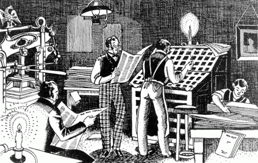
I have some pre-digital Sydney Morning Herald lead type. I’m not exactly sure what I’m going to do with it, as I don’t have a printing press or even a type cabinet, so I suspect that a good proportion of it will go the way of most of the other Herald lead and get melted down. Once I can bear to part with it, that is. My dilemma is that it is body text, maybe 7pt or 8pt, so it’s fiddly to handle, not that you want to be handling it too much and breathing in the dust, and anyway, for my creative purposes I don’t need a lot, just a few pieces of each letter. The type came accompanied by this picture, which I can only assume is an illustrated snapshot of the Herald back in the day. I particularly like the press on the left, which looks very much like a Columbian Press. The Columbian Press, manufactured in Philadelphia in 1813, was the first press to be operated efficiently by levers, and was designed to allow a whole newspaper page to be printed in a single pull. The counterweight, in the form of a neoclassical eagle, sits balanced on the counterpoise lever. The scene depicted here looks rather relaxed, but perhaps it is a slow news day and they are nutting out the cryptic crossword.
Earth
This week I went to see Earth Platinum at the State Library. Earth Platinum is the largest atlas in the world: 128 pages, 150 kilos and measuring 1.8 x 1.4 metres closed. The Earth books are the brainchild of Millennium House publisher Gordon Cheers. Through my association with Millennium House as a designer on many of their books, I followed the trials and tribulations of Earth during its production, but seeing it in the flesh was something else. It was open at Europe, and I desperately wanted to turn the page and look at more. I have a copy of Earth Concise, which is a mighty book in itself. At 576 pages and measuring 410 x 315 mm it is only concise in relative terms, but at least I can lift it and it does fit (albeit sideways) on my bookshelf!
Encyclopaedia Britannica
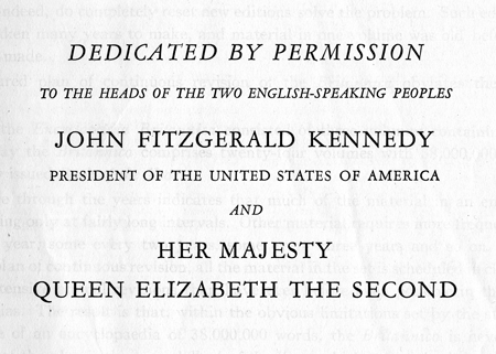
Encyclopaedia Britannica was founded in 1768 and the first edition was published as three volumes. The last printed edition was published in 2010, and it had grown to 32 volumes, 32 640 pages, with almost 4500 contributors (including Nobel prize winners and American presidents) and about 100 editors. When I was quite young my family procured a set of encyclopedias, bought second-hand from I don’t know where, an already well-used 14th edition 24-volume set published in 1962. I used it often and with great enjoyment (they were books after all!) but once I finished school those stuffy pages held little interest for me. Until recently, that is, when my family wanted to get rid of it, and I thought it would make excellent fodder for book art re-purposing. To my surprise I am finding that it holds almost more interest now than it did then. The publisher was William Benton—a Minnesota-born (on 1 April 1900, how wonderful!), Yale-educated, Connecticut senator—and Harry S Ashmore, the editor-in-chief, was a Pulitzer prize winner. The departmental editors and advisors is a staggeringly impressive list of highly educated people, and as I flick through the pages of Volume 1 (A to Annoy) I find information about Absolute Pitch, Aero Engines, Alaska, Amarillo, Andromeda and Anhydride—with a sense of discovery and surprise that doesn’t come from looking stuff up on Wikipedia. No doubt these volumes will end up reconfigured, cut up, folded, papier mached, rebound and restructured, but perhaps I will enjoy them for a while longer as the books they are. And perhaps I will keep this dedication page.
The garden island
For a minute or so I was filled with hope that there might be a publishing industry on Kauai—the garden island referred to here—but the building houses an Italian cafe. However, the local newspaper is called The Garden Island and is housed in a newer building across the road, so I would guess that, when the newspaper was first published in 1902, it started its life here. I like the incised sans serif lettering, stark and graphic in the afternoon light.
New reality in spelling
Really, it’s going from bad to worse. Last December, on the morning of the Lindt cafe siege in Martin Place, our esteemed newspaper, digital edition, published a photograph, headline and, in upper case under the byline, the words ‘FAKE BODY’. At first this elicited a mere eye-rolling ‘here’s a good one’ response in my household, but as the seriousness of the situation unfolded, it became a far from amusing blunder. The typo in this headline, while not quite so insensitive as the story that went online before the text was ready, is still inexcusable. The Sydney Morning Herald is the oldest continuously published newspaper in Australia, although given its numerous staff cutbacks and resultant decrease in quality of journalism—not to mention the increasing occurrence of mistakes in spelling and grammar—it must be hanging on by a thread.
Ipsy lipsy lopsy lorum
In publishing and design, ipsy lipsy lopsy lorum—commonly known as lorem ipsum—is placeholder, or dummy, text. The use of dummy text allows the typography and layout of a page to be designed without using the actual text. This is useful for many reasons: editing and design might be occurring simultaneously, and the manuscript is not ready for layout; the text might not be written at all, so the use of dummy text can determine the word count required; meaningful text can be distracting if the graphic elements are the main focus of a presentation; more words might need to be added and dummy text can be used as filler. Back when we used Quark instead of InDesign, there was a plug-in that allowed you to choose the language of your dummy text: Klingon was particularly popular! Lorem ipsum is based on a first-century text by Cicero, and although it looks Latin, the words have been scrambled and changed so that it is nonsense Latin. As for what you call it—placeholder, dummy, Latin, lorem ipsum—I’ve always called it ipsy lipsy lopsy lorum, or ipsy lipsy for short.
Spellcheck
The last couple of weeks my routine has changed because I am temporarily working in-house. My assignment is with a publisher with whom I have an excellent longstanding relationship, and I regard them with great esteem. This closer-than-usual proximity to the inner workings of getting quality books to print has reminded me of the enormous effort that is put into checking and re-checking and checking again. My current morning routine includes doing the crossword and scanning the headlines, and it is clear that attention to detail—for that matter, a basic proofread—is not high on every publisher’s list.
Cut to 600 words
My husband has developed an uncanny knack for spotting typos and dummy text that has been published inadvertently. The first time I realised this was when he steered me towards the local bookshop window and stood back until I found it for myself—a glaring mistake on a poster for Kobo eBooks, so shocking that I was embarrassed to call myself a publishing professional. Apart from the usual typos and mis-use of punctuation he has found bullet points in authoritative books that read ‘one more point here if you can come up with one’ and paragraphs of ipsy lipsy lopsy lorum in tertiary textbooks. He came upon this instruction to the subs while reading the weekend paper on the iPad.


![concise[c]alphabetcitypress](https://alphabetcitypress.com/wp-content/uploads/2016/01/concise.gif?w=525)

![gardenisland[c]alphabetcitypress](https://alphabetcitypress.com/wp-content/uploads/2015/08/gardenisland.gif?w=525)
![worforce[c]alphabetcitypress](https://alphabetcitypress.com/wp-content/uploads/2015/07/worforce.gif?w=525)
![lorumipsum[c]alphabetcitypress](https://alphabetcitypress.com/wp-content/uploads/2014/10/lorumipsum.gif?w=525)
![practice[c]alphabetcitypress](https://alphabetcitypress.com/wp-content/uploads/2014/07/practice.gif?w=525)
![600words[c]alphabetcitypress](https://alphabetcitypress.com/wp-content/uploads/2014/04/600words.gif?w=525)