Superior

My book Type Town has made it to the printer! Type Town is a photographic feast that highlights the quirky, the fanciful and fantastic typefaces and signage that contribute to the rich cultural fabric of Sydney’s vibrant Inner West. This is one of more than 280 photographs from the book, and here is the story behind the picture.

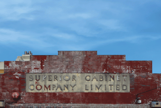
In February 1935 the Sydney Morning Herald reported a spectacular fire at the Superior Cabinet Company Limited in Excelsior Street. Flames from the incinerator, which had been filled with waste wood, set fire to the wall, sparks ignited sawdust on the floor and the highly flammable oils and varnishes exploded. Within minutes the interior was ablaze. Dense, acrid smoke poured from the building, and flames leapt fifty feet into the air. Brigades from Petersham and Leichhardt worked to control the fire while police tried to control the crowd of sightseers—but it was too late to save the furniture. I don’t know if this building on Elswick Street became the new premises, or was another street frontage of the Excelsior Street factory, but the typography remains intact and the lush red paint is a reminder of a dramatic piece of local history.

Type Town will be launched at my exhibition Typecast on 22 August.

Condemned

I am currently working on a project that is taking me in a slightly different direction to usual. For many years I have worked as a book designer for publishing houses as well as, more recently, for individuals. I am now taking the leap into publishing my own book: a full-colour photographic volume exploring the rich typographic landscape of my neighbourhood. My photos focus on signage and street art I find either beautiful or unusual, rendered through my own personal aesthetic. This stencilled sign hangs on a tree which is, as it announces, condemned (by roadworks). I will be posting more photographs of my typographic neighbourhood in the coming months.

Diacritical marks

A diacritical mark is a sign that is written above or below a letter to indicate a difference in pronunciation, tone or stress from the same letter when unmarked. Umlauts, macrons, cedillas, dots, breves, accents and graves are examples of diacritical marks. Whether it’s because I didn’t learn French at school, or because I have a tendency to confuse left and right, I get accents and graves mixed up. I know that one goes to the left and one goes to the right, and that they appear above vowels, but I don’t actually know how or when to use them. If I ever have to type the word cafe, for example, I either leave the mark off altogether, because the word is still recognisable, or rely on the spellchecker! Macrons (a horizontal line above the letter) and umlauts (the double dot) don’t cause me nearly as much angst.

Monday

It’s Monday, which means it is blog day, and this week I find myself devoid of inspiration. I’m currently working on several major projects that, even though they are progressing apace, are at a stage where they’re forming a major confluence in my headspace, and there’s just no room for anything else. Despite the fact that all these projects involve aspects of typography, I’m finding it difficult to drag my thoughts clear enough away. But yes—it’s obvious: a typeface called Monday! There is a particularly lovely serif typeface, with several weights, designed by Henrik Kubel of London-based A2-Type, but I don’t have it to use. I do have the Monday you see here, an internet font which I doubt I will ever use. I have Lemon Tuesday too, which I am also including because I’m running late and it’s almost tomorrow.

Brackets

A bracket is a punctuation mark used to set text apart within a larger body of text. Brackets come in pairs—an opening bracket and a closing bracket, and they can be round, curly, square or angled. There are many names for brackets. Parentheses (meaning, literally, ‘to put aside’) are also called round brackets, soft brackets or first brackets. Square brackets are also known as hard brackets or second brackets. Braces are curly, swirly, birdie, squiggly, fancy or twirly. Chevrons are pointy, angle, diamond or triangular. Whatever you like to call them, they have an important place in the world of punctuation. Parentheses, for example, have been used in written English since the 1500s and chevrons are used today in html markup.

TT Corals

TT Corals is one of my favourite typefaces at the moment. It has an extensive array of weights—thin, light, regular, bold, extra bold, and black—that combine and complement each other well. TT Corals is a modern humanist sans serif typeface, designed in 2016 by the Russian-based TypeType team. I like it because it is easy to read as well as being stylish, putting it in the good company of typefaces like Meta and Freight Sans.

DF Diversions

There’s a summer heatwave here. Yes, I know, it’s summer and it’s Australia, so saying it’s hot is somewhat tautological. But really, it’s been hot. Last Sunday the weather app on my phone (it’s addictive, isn’t it?) told me the temperature was 45 degrees. I have an OCD tendency to want to know the temperature in fahrenheit too. A quick calculation using the ‘add 15 and double it’ formula made it a staggering 120 degrees. (More accurately it translates to 113, but either way, when it gets that hot what’s a few degrees either way?) News reports of hordes of people at the beach proved the point and I bet the cinemas were packed too, given how icy their airconditioning usually is. We stayed inside all day in a dark room with the fan on, but perhaps we should have ventured to the beach, which this dingbat, from the DF Diversions character set, makes enticing.

Book

Often the best things turn up when you are not looking for them, like this scrap of street poster. I have long been in the habit of looking for type everywhere I go — and even more so these days as I have a new project in the pipeline — but this fragment appeared when my focus was elsewhere. I like it on so many levels: the bold, no-nonsense sans serif type, the colour, the very scrappiness of the torn edges and glue residue. My upcoming project involves type and a book, so this piece of urban detritus is remarkably prescient.

Toolite

I never intended my ‘short break’ to stretch to eleven months, but time has a way of ticking along and space has a way of getting itself filled. Over the last few weeks people have started  to ask me what’s going on and if I’m returning to the blog, so if you are reading this, I guess the answer is that I have been successfully prodded. And in the way of all things timely and synchronous, a dusty ratty torn cardboard box came into my possession (the contents of which are for next time) with this most wonderful Toolite label stuck on the side.

I’ll be back

illbeback[c]alphabetcitypress

Alphabet City Press is taking a short break, but I’ll be back. I am not an android assassin who has been denied entry into a police station, and therefore I will not be returning by driving a car through the doors to gain access. My return will be a little quieter—just the usual thing that will no doubt involve typography in some way. In the meantime, the DF Commercials clock and the wonderful Bach Script, a recent release from the Mendoza Vergara design studio, will have to suffice.