
This substation, in Ramsay Street, Five Dock, shows the original signage, still in excellent condition. The elegant lettering sits in contrast to the harsh concrete and brick building, and is typical of substations of the era.

books • prints • typography • design
This substation, in Ramsay Street, Five Dock, shows the original signage, still in excellent condition. The elegant lettering sits in contrast to the harsh concrete and brick building, and is typical of substations of the era.
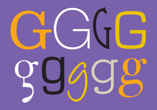
The letter G is the seventh letter and fifth consonant of our alphabet, and evolves from the Phoenician gimel and the Greek gamma. G is a guttural consonant, articulated in the back of the mouth or throat. It can sound hard (a velar plosive, where the back of the tongue comes in contact with the soft palate)—guard, Garamond, guts, glue; or soft (a velar nasal)—sing, gin, danger, ginger; or even silent!—gnat, gnome, design, diaphragm. The lowercase g is typographically rich, with single-storey and double-storey variants, bowls, ears, loops, tails and ears.
![zennor[c]alphabetcitypress](https://alphabetcitypress.com/wp-content/uploads/2016/07/zennor.gif?w=525)
Zennor was designed by Phill Grimshaw in 1995. Grimshaw studied at Bolton College of Art before earning a place at the London Royal College of Art in the early 1970s. He subsequently specialised in type design, returning to Lancashire where he established a commercial lettering studio. Grimshaw was prolific: he created dozens of dynamic, calligraphic-inspired typefaces, including Arriba, Braganza, Kendo, Scriptease, Tempus Sans, Pristina and Grimshaw Hand. In turn, his calligraphic work was inspired by typography, and his experimental crossover technique earned him a formidable reputation. His 1992 typeface, Hazel, became the last type design to be produced by Letraset as a dry transfer.
![youngbaroque[c]alphabetcitypress](https://alphabetcitypress.com/wp-content/uploads/2016/07/youngbaroque.gif?w=525)
Young Baroque was designed in 1984 by influential and well-regarded graphic designer, typographer, teacher and author Doyald Young. Young held the honorary title of ‘Inaugural Master of the School’ at the Pasadena Art Center College of Design, where he taught lettering, logo design and typography until his death in 2011. In 2009 he was honoured with the prestigious AIGA Medal. His AIGA biography states that: ‘An education with Doyald Young would be to learn from one of the most precise hands and knowledgeable eyes of our time. His understanding of the form of the letter, the arc of the curve and the subtleties of logotypes, is unsurpassed in North America.’ In addition to the numerous logos and trademarks he designed, he also had a swag of entertainment credits—typography and design for Sinatra, Disney, Prince, Carnegie Hall, the Grammy and Golden Globe Awards are just a few. His self-published books include Logotypes & Letterforms, Fonts & Logos and Dangerous Curves: Mastering Logotype Design, and as well as Young Baroque, he designed the typefaces ITC Éclat, Home Run, and Young Gallant.
![xylo[c]alphabetcitypress](https://alphabetcitypress.com/wp-content/uploads/2016/07/xylo.gif?w=525)
How pleased I am that there is a legitimate typeface beginning with x, and that I don’t have to resort to using The X-Files Font or Xmas something or other for my alphabet letters, both of which seem like cheating. Real typeface it might be, but there’s not much information to be found, other than it was designed by the Benjamin Krebs type foundry in Frankfurt am Main in 1924, and is published by ITC and owned by Letraset. While it originated in Germany, it was unearthed in 1995 in a London printer’s reference book, and was subsequently digitised by Letraset. The chunky carved appearance of the typeface is reflected in its name—xylo being the Greek word for wood.
![wiesbadenswing[c]alphabetcitypress](https://alphabetcitypress.com/wp-content/uploads/2016/07/wiesbadenswing.gif?w=525)
Wiesbaden Swing, created by German designer and calligrapher Rosemarie Kloos-Rau and released by Linotype in 1992, is based on her own handwriting. Kloos-Rau says that her typeface is ‘my contemporary contribution to the field of calligraphy, a headline font which offers a fresh and unconventional approach to typography’. Wiesbaden Swing is ranked as one of the famous Linotype fonts from the last decade, and in 2010 the drawn prototype was added to the Berlin Calligraphy Collection. This collection, founded in 1999 by the Berlin Academy of Arts, contains sheets of calligraphy, prints, reproductions, typographical clean copies, posters and poster designs, book covers and artist books—a selection of works which encompass calligraphic styles ranging from the classical to more expressive forms.
![verdana[c]alphabetcitypress](https://alphabetcitypress.com/wp-content/uploads/2016/06/verdana.gif?w=525)
Verdana was designed by Matthew Carter for Microsoft in 1996 and has subsequently been distributed with both Windows and Mac operating systems. Verdana is the sans serif partner to serif Georgia—a pairing of typefaces suited to screen use. Verdana has a large x-height so lower case characters look bigger—but not so big that you can’t tell them apart from upper case characters—and it is generously spaced so it can be read at small sizes. The bold weight is thicker than many other bolds—also making it good for on-screen legibility. Verdana even made news when Ikea, in an attempt to unify its branding, ditched Futura as its printed catalogue typeface. The Verdanagate controversy caused outrage, the New York Times going so far as to say that it ‘is so offensive to many because it seems like a slap at the principles of design by a company that has been hailed for its adherence to them’. Hmm. I guess that’s a whole other debate.
![universityroman[c]alphabetcitypress](https://alphabetcitypress.com/wp-content/uploads/2016/06/universityroman.gif?w=525)
University Roman was designed in 1983 by Letraset Type Studio designers Mike Daines and Philip Kelly. Featuring narrow upper case letters with high crossbars, it is a decorative typeface based on Speedball hand lettering. Speedball refers to both the style of calligraphy and lettering and the pens, nibs and inks used in its execution, and the Speedball Textbook, originated by Ross F George in 1915, gives instructions for drawing various alphabet styles, as well as advice on selecting tools and materials.
![tradegothic[c]alphabetcitypress](https://alphabetcitypress.com/wp-content/uploads/2016/06/tradegothic.gif?w=525)
Trade Gothic is a sans serif typeface designed by Jackson Burke. It was a work in progress from 1948 to 1960, by which time Burke had come up with fourteen style and weight combinations, including the very stylish Trade Gothic Extended. Trade Gothic has narrower letterforms than many other sans serif typefaces, allowing more text to be set across a measure, and while it is generally considered to lack unity as a family, it retains popularity because it works so well in combination with roman text fonts. One unusual feature is that, in some digital versions, the default bold weight is more condensed that the regular weight, which is opposite to normal.
![shelley[c]alphabetcitypress](https://alphabetcitypress.com/wp-content/uploads/2016/06/shelley.gif?w=525)
Shelley, designed by Matthew Carter in 1972, is named for George Shelley, the English writing master of the early eighteenth century. Shelley is a formal script typeface consisting of a single weight of lowercase letters and three variations of uppercase—Allegro, Andante and Volante. Its decorative curves and graceful flourishes make this typeface suitable for display and decoration rather than large amounts of text. George Shelley was the author and editor of The Penmans Magazine: Author of Natural Writing in all the Hands, with Variety of Ornament (1709) and Alphabets in All the Hands (1715)—titles almost as elaborate as his writing!
