Typesetting

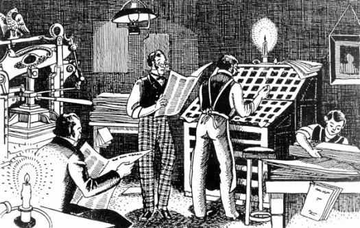
I have some pre-digital Sydney Morning Herald lead type. I’m not exactly sure what I’m going to do with it, as I don’t have a printing press or even a type cabinet, so I suspect that a good proportion of it will go the way of most of the other Herald lead and get melted down. Once I can bear to part with it, that is. My dilemma is that it is body text, maybe 7pt or 8pt, so it’s fiddly to handle, not that you want to be handling it too much and breathing in the dust, and anyway, for my creative purposes I don’t need a lot, just a few pieces of each letter. The type came accompanied by this picture, which I can only assume is an illustrated snapshot of the Herald back in the day. I particularly like the press on the left, which looks very much like a Columbian Press. The Columbian Press, manufactured in Philadelphia in 1813, was the first press to be operated efficiently by levers, and was designed to allow a whole newspaper page to be printed in a single pull. The counterweight, in the form of a neoclassical eagle, sits balanced on the counterpoise lever. The scene depicted here looks rather relaxed, but perhaps it is a slow news day and they are nutting out the cryptic crossword.

Road to where?

H1West[c]alphabetcitypress

According to some of those top ten lists, Honolulu is the second worst US city for traffic, and I believe it. Getting around is not hard, but geez it can be slow, and not just at pau hana—Hawaii’s afternoon peak hour. One time, driving east along the HI, we were just a couple of miles from our exit when Morgan Freeman on Waze alerted us to a problem ahead and suggested it would be quicker to drive to the other side of the island and back down the Pali Highway—a detour so long we stayed on the H1 parking lot! One time we needed to change our rental car and ended up in Pearl City because, due to a typo in the driving instructions, we were looking for an exit that didn’t exist. We also found this rather interesting direction. Where does that mystery turnoff to the west go, I wonder?

CMYK

cmyk[c]alphabetcitypress

CMYK stands for Cyan, Magenta, Yellow and Key (or blacK)—the colours that are used in four-colour process printing. Overlapping dots of cyan, magenta, yellow and black produce the full spectrum of reflective colour found in photographs. Colours for type and graphics can be made from combinations of these colours as percentages. For example, 100 percent yellow and 50 percent magenta makes orange, or a mixture of cyan and yellow makes green. In the printing process, the screen for each colour is printed at a different angle to improve print quality and reduce moiré patterns. In book design, a fifth black plate is often used for text, because if the book is published in several languages, only the black text plate needs to be changed.

New reality in spelling

worforce[c]alphabetcitypress

Really, it’s going from bad to worse. Last December, on the morning of the Lindt cafe siege in Martin Place, our esteemed newspaper, digital edition, published a photograph, headline and, in upper case under the byline, the words ‘FAKE BODY’. At first this elicited a mere eye-rolling ‘here’s a good one’ response in my household, but as the seriousness of the situation unfolded, it became a far from amusing blunder. The typo in this headline, while not quite so insensitive as the story that went online before the text was ready, is still inexcusable. The Sydney Morning Herald is the oldest continuously published newspaper in Australia, although given its numerous staff cutbacks and resultant decrease in quality of journalism—not to mention the increasing occurrence of mistakes in spelling and grammar—it must be hanging on by a thread.

Spellcheck

practice[c]alphabetcitypress

The last couple of weeks my routine has changed because I am temporarily working in-house. My assignment is with a publisher with whom I have an excellent longstanding relationship, and I regard them with great esteem. This closer-than-usual proximity to the inner workings of getting quality books to print has reminded me of the enormous effort that is put into checking and re-checking and checking again. My current morning routine includes doing the crossword and scanning the headlines, and it is clear that attention to detail—for that matter, a basic proofread—is not high on every publisher’s list.

Cut to 600 words

600words[c]alphabetcitypress

My husband has developed an uncanny knack for spotting typos and dummy text that has been published inadvertently. The first time I realised this was when he steered me towards the local bookshop window and stood back until I found it for myself—a glaring mistake on a poster for Kobo eBooks, so shocking that I was embarrassed to call myself a publishing professional. Apart from the usual typos and mis-use of punctuation he has found bullet points in authoritative books that read ‘one more point here if you can come up with one’ and paragraphs of ipsy lipsy lopsy lorum in tertiary textbooks. He came upon this instruction to the subs while reading the weekend paper on the iPad.

Ink traps

inktraps[c]alphabetcitypress

Ink traps are a feature of certain typefaces, most notably Bell Centennial, where corners or details of the letterforms are removed, usually at a junction, to compensate for the spread of ink during printing on newsprint. Bell Centennial was designed by Matthew Carter for AT&T, who required a new phone directory typeface (for their 100th anniversary) that would fit more characters per line and increase legibility at a smaller point size. Carter improved on AT&T’s earlier typeface, Bell Gothic, by increasing x-height, slightly condensing character width, opening up counters and bowls, and drawing deep ink traps, which, at the smaller point size used in the phone book, become invisible.

Nuts and mutton

nutsmutton[c]alphabetcitypress

An en dash is used to connect two things or denote a range, for example dates (13–14 June), places (Sydney–Hobart) and pages (22–33). An en dash is approximately the width of a lowercase n, and is also referred to as a nut dash. An em dash indicates a transition — or added emphasis — within a sentence — or an afterthought. An em dash can replace commas, semicolons, colons and parentheses to indicate an interruption or change of thought. An em dash is approximately the width of an uppercase M and is also known as a mutton dash.