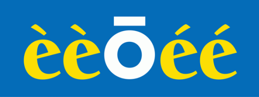
A diacritical mark is a sign that is written above or below a letter to indicate a difference in pronunciation, tone or stress from the same letter when unmarked. Umlauts, macrons, cedillas, dots, breves, accents and graves are examples of diacritical marks. Whether it’s because I didn’t learn French at school, or because I have a tendency to confuse left and right, I get accents and graves mixed up. I know that one goes to the left and one goes to the right, and that they appear above vowels, but I don’t actually know how or when to use them. If I ever have to type the word cafe, for example, I either leave the mark off altogether, because the word is still recognisable, or rely on the spellchecker! Macrons (a horizontal line above the letter) and umlauts (the double dot) don’t cause me nearly as much angst.
Brackets
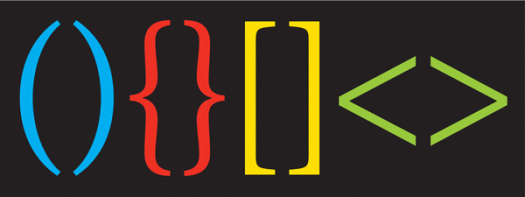
A bracket is a punctuation mark used to set text apart within a larger body of text. Brackets come in pairs—an opening bracket and a closing bracket, and they can be round, curly, square or angled. There are many names for brackets. Parentheses (meaning, literally, ‘to put aside’) are also called round brackets, soft brackets or first brackets. Square brackets are also known as hard brackets or second brackets. Braces are curly, swirly, birdie, squiggly, fancy or twirly. Chevrons are pointy, angle, diamond or triangular. Whatever you like to call them, they have an important place in the world of punctuation. Parentheses, for example, have been used in written English since the 1500s and chevrons are used today in html markup.
Protected birds
Well, if there were birds, I certainly saw no sign of them! But perhaps, in the middle of a sunny but cool day in late winter, they were nesting well away from my line of sight. This view captured my attention not just for its message, but for the range of hard surfaces surrounding it, which appear at odds with the imagery you would usually associate with birds—like trees and leaves and branches, materials which have a great deal more inherent suppleness than aluminium, concrete and brick. Also somewhat eyecatching is the use of title case, sometimes referred to as maximal caps. Minimal capitalisation, or sentence case, is more the thing these days. While I guess there’s nothing actually wrong with title case here, it’s just odd and stylistically outmoded. Which really only goes to show that I am not immune to the influence of typographic fashion.
’Tis the season
Walking past the local butcher’s window this morning, I see that the festive season is upon us, because we are now being invited to order our christmas ham’s and turkey’s! It’s reassuring to know that, in this chaotic world, some things come around like clockwork, and that the punctuation is so reliable.
Dot dot dot
In typography, an ellipsis is, as its common name suggests, a series of three dots. It has several uses, and its placement can convey a great deal of information by the very fact of taking the place of words that are absent. Primarily, it indicates an intentional omission of words from a larger text without changing the meaning. This can be an unfinished thought, a leading statement, a pause, a feeling. As for style, I use the option+semicolon keyboard command, which gives a non-breaking three dots, and I always insert a space each side of it. The well-regarded and much-used Chicago Manual of Style recommends the use of an ellipsis for any omitted word, phrase, line or paragraph from within—but not at the end of—a block of text, and their preferred method of construction is three spaced periods.
Inverted commas
Inverted commas, quotation marks, quote marks, speech marks, sixty-six-ninety-nines. Whatever you want to call them, they are pairs (one opening, one closing) of double or single punctuation marks to indicate direct speech, quotations or phrases. Although the double quotation mark dates from the fifteenth century, usage specific to quoted material did not became common till 200 years later. Single quotation mark came into being around 1800 to indicate a second level of quotation. In current usage this order has been reversed. Single quotes are used first, and a quote within a quote takes on double quote marks. Like any letter form or punctuation mark, inverted commas vary in design from typeface to typeface, from the lush curves of Sahara Bodoni to the chunky blocks of Interstate and everything in between.
Yellow dot
I couldn’t remember what O’Maras did (or indeed if the information was even displayed) without looking them up because I was so dazzled by their use of a yellow dot in place of the apostrophe. It’s really very good! So simple, yet so effective because it loses nothing in translation, is eye-catching without dominating, and is quite visually pleasing.


![protectedbirds[c]alphabetcitypress](https://alphabetcitypress.com/wp-content/uploads/2016/09/protectedbirds.gif?w=525)
![hams[c]alphabetcitypress](https://alphabetcitypress.com/wp-content/uploads/2015/11/hams.gif?w=525)
![ellipsis[c]alphabetcitypress](https://alphabetcitypress.com/wp-content/uploads/2015/10/ellipsis.gif?w=525)
![invertedcommas[c]alphabetcitypress](https://alphabetcitypress.com/wp-content/uploads/2015/10/invertedcommas.gif?w=525)
![om[c]alphabetcitypress](https://alphabetcitypress.com/wp-content/uploads/2013/09/om.gif?w=525)