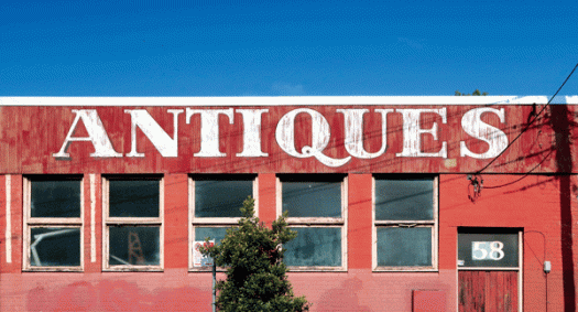
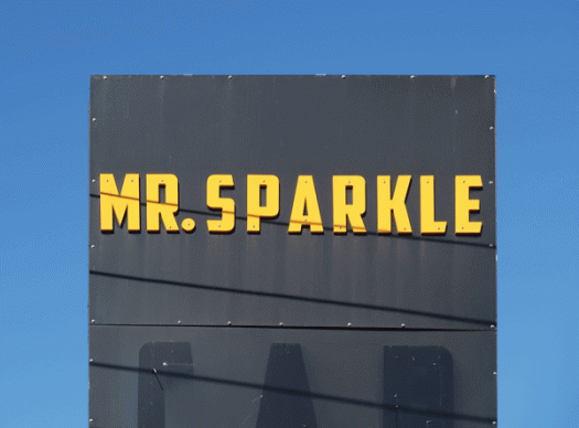
This pleasing type looms large at the bend in the road along Mullens Street, Balmain. This image comes from my book Type Town: a neighbourhood of glyphs, graffiti, ligatures and legs, which will be launched at the exhibition Typecast on Wednesday 22 August. All welcome!
Mr Sparkle
Substation
Furniture
Here is another photograph from my book Type Town. Pictured is one of two W MacFarlane Furniture buildings. This one, the larger of the two, is in Westbourne Street, Petersham. The second is across the street on the corner of Charles Street. Both display similar signage, complete with thistles on matching curved pediments.
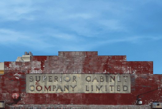
Superior
My book Type Town has made it to the printer! Type Town is a photographic feast that highlights the quirky, the fanciful and fantastic typefaces and signage that contribute to the rich cultural fabric of Sydney’s vibrant Inner West. This is one of more than 280 photographs from the book, and here is the story behind the picture.
In February 1935 the Sydney Morning Herald reported a spectacular fire at the Superior Cabinet Company Limited in Excelsior Street. Flames from the incinerator, which had been filled with waste wood, set fire to the wall, sparks ignited sawdust on the floor and the highly flammable oils and varnishes exploded. Within minutes the interior was ablaze. Dense, acrid smoke poured from the building, and flames leapt fifty feet into the air. Brigades from Petersham and Leichhardt worked to control the fire while police tried to control the crowd of sightseers—but it was too late to save the furniture. I don’t know if this building on Elswick Street became the new premises, or was another street frontage of the Excelsior Street factory, but the typography remains intact and the lush red paint is a reminder of a dramatic piece of local history.
Type Town will be launched at my exhibition Typecast on 22 August.
Re:Play
Re:Play, an exhibition of new work from Sydney Book Art Group, opens this week. Please join us at the opening, or drop in and say hello any time over the next couple of weeks.
SydneyBAG is also hosting two public events to accompany Re:Play. The first is a panel discussion in the gallery on Sunday 1 July, when four guest book artists will come together to discuss what makes an Artists’ Book. The second event is a workshop, on Wednesday 4 July. Two SydneyBAG artists will lead participants in an evening of playful paper folding and construction.
SydneyBAG artists meet regularly and collaborate and exhibit when the opportunity arises. While not exclusively book artists, it is books, and the love of books, that unites the group.
Public library
I have been into this building many times, but it is only this week, while gathering a few more images for my upcoming book Type Town, that I took proper notice of the words. I never knew it said ‘public library’! I knew there were words, I know this is a library, but I know it as the State Library—which is what the sign around the corner on Macquarie St says. I also discovered that this section of the street is called Shakespeare Place. One thing I am still unsure about, however, is the architectural term for the part of the building where the text appears. Above is the pediment and cornice, below is the architrave—but the section in between—I think it is the frieze, but I’m not sure. Perhaps I could find the answer inside, on the library shelves.
Rosella
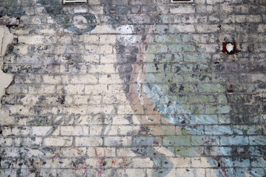
Ghost signs are the faded remnants of old hand-painted advertising signs. You usually see them on the side brick wall of a building. Sometimes the state of their preservation is quite remarkable, and the sign is clear and legible. Other times just a hint of worn and weathered lettering remains. This one was uncovered by a restaurant in Cabarita when they removed some tiles in the process of renovating. It is from an advertisement for Rosella, best known for its tomato soup and tomato sauce, and while I can’t make out much of the text, I can clearly see the trademark bird and appreciate the beautiful patina.
5522
The book I am currently working on is called Type Town, which, as the title suggests, looks at the typography of my surroundings. When I first started planning it I knew that the signage and street art in my neighbourhood was rich with possibility, but during the last few months of closer scrutiny it has proved to be even more interesting and engaging that I originally anticipated. These beautiful numbers are from a boarded up butcher’s shop window in Rozelle.
Paper string
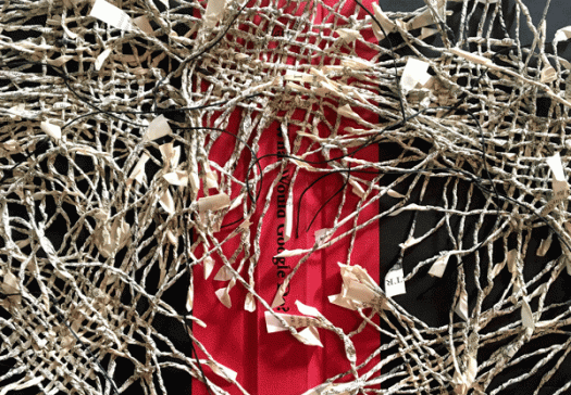
There’s a lot going on in my studio. I am working away at my book—my book to be published, that is, not my artists’ book (it gets confusing!)—and at the same time I’m preparing for three exhibitions. Today I’m focussing on the first of those exhibitions: a show called Re:Play, featuring new work from my book group, Sydney Book Art Group. This is a detail from a piece I have just finished. I used a discarded cover from a book called What Would Google Do? and made paper string from Encyclopedia Britannica pages. The string is woven and then sewn onto the cover. It’s fiddly and challenging making all that paper string, but I’ll be making more of it today for my next piece!

