TT Corals

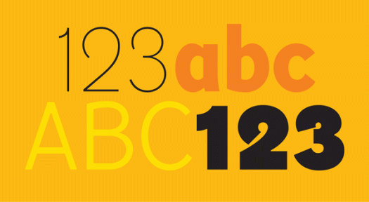
TT Corals is one of my favourite typefaces at the moment. It has an extensive array of weights—thin, light, regular, bold, extra bold, and black—that combine and complement each other well. TT Corals is a modern humanist sans serif typeface, designed in 2016 by the Russian-based TypeType team. I like it because it is easy to read as well as being stylish, putting it in the good company of typefaces like Meta and Freight Sans.

Green bird

Everyone knows that it is important to have ecological and environmental awareness and responsibility, yet every day we encounter a mess of packaging that is an eyesore and an assault on our aesthetic sensibilities and quality of visual life. Here’s an example of what I consider to be a much more clever and sensitive way of getting a message across. Brown paper packaging, simple one-colour printing, and using a recognised symbol as part of the illustration—resulting in a serious message delivered with lightness. In fact I kept the packaging and brought it home half way around the world in order to re-use it in some way! I’m momigami-ing it and using it in my next artists’ book.

The Beautiful is Vanished

Wow, Taylor Caldwell was prolific! She wrote as Taylor Caldwell, Marcus Holland, Max Reiner and J Miriam Reback! She published more than 60 historical and religious-themed novels. Her first novel, The Romance of Atlantis, was written when she was 12, and was published about 60 years later. Her stories have been praised for being intricate and suspenseful, and there is even a Taylor Caldwell Appreciation Society. But it seems that not everyone approved of her career choice. Her father sent her to work in a bindery as a more suitable activity; in the 1930s there was a public stir when it became known that ‘Taylor Caldwell’ was not a man, as was presumed; and in the 1940s Time magazine reported that her husband burned 140 of her unpublished manuscripts. Seems nothing could stop her writing, though, and good for her! Despite all this it’s the book jacket I like. This one dates from 1951—dramatic illustration, hand-crafted typography.

F Neural

Here’s a typeface I’d love to find a use for. It came with FUSE 1–20, the 2012 anthology of the FUSE project, an experimental publication on typography and fonts launched by Neville Brody and Jon Wozencroft in 1990. The original FUSE was a quarterly ‘magazine’ published by FontShop. Each issue was thematic and contained a floppy disk (!) with fonts, plus posters, in a cardboard carton. I can’t find any information that tells me who designed F Neural, or when, but I am impressed by its inventiveness, and how well-crafted it is despite its deconstructed appearance.

The letter G

The letter G is the seventh letter and fifth consonant of our alphabet, and evolves from the Phoenician gimel and the Greek gamma. G is a guttural consonant, articulated in the back of the mouth or throat. It can sound hard (a velar plosive, where the back of the tongue comes in contact with the soft palate)—guard, Garamond, guts, glue; or soft (a velar nasal)—sing, gin, danger, ginger; or even silent!—gnat, gnome, design, diaphragm. The lowercase g is typographically rich, with single-storey and double-storey variants, bowls, ears, loops, tails and ears.

Airwell

I was tagging along for the ride. It was a hot day, and when we reached our destination I decided to stay in the car for the short time that was needed for the errand to be run. Maybe it was the heat that drew my attention to the airconditioning units, maybe it was the total uninterestingness of the car park in general, maybe I was staring into space. Whatever the reason, my eyes landed on the aircon badging, and curiosity about the typography has led me to discover that the company started up in the 1940s, and while I’m sure the logo has been modified over the years, it still retains an air of retro.

DF Diversions

There’s a summer heatwave here. Yes, I know, it’s summer and it’s Australia, so saying it’s hot is somewhat tautological. But really, it’s been hot. Last Sunday the weather app on my phone (it’s addictive, isn’t it?) told me the temperature was 45 degrees. I have an OCD tendency to want to know the temperature in fahrenheit too. A quick calculation using the ‘add 15 and double it’ formula made it a staggering 120 degrees. (More accurately it translates to 113, but either way, when it gets that hot what’s a few degrees either way?) News reports of hordes of people at the beach proved the point and I bet the cinemas were packed too, given how icy their airconditioning usually is. We stayed inside all day in a dark room with the fan on, but perhaps we should have ventured to the beach, which this dingbat, from the DF Diversions character set, makes enticing.

Hypnopaedia

Hypnopaedia was designed by Zuzana Licko of Emigre in 1997. The character set comprises 140 patterns, each of which is made up of a single letter rotated and interlocked, resulting in an abstract, ornamental illustration. I learnt something new today. Hypnopaedia is not just the name of a typeface—it is the name for sleep learning, or learning by hearing while asleep or under hypnosis. Perhaps I’ll have a siesta …

Xmas Pi

Xmas Pi and christmas pie. It’s that time of year again. In my neck of the woods Christmas day will be either blistering hot with a chance of late thunderstorms, or wonderfully mild and raining, a respite from the blistering hot days preceding it. I’m hoping for the relief of a cool day, but whatever the weather we will sit outside and feast on prawns and pudding. Wishing good cheer and happy days to everyone.

Lemons

Who ever would have imagined that supermarket shopping bags would become interesting. I found this bag at, of all places, the Whole Foods Market on Maui. It was immediately appealing because, at the time, reusable shopping bags in Australia were pretty much available only in plain green. We still call them green bags, although now a green bag can be blue, orange, patterned, or anything else! (The best bags come from the place I buy coffee beans—they are black with a repeating pattern in orange.) Despite the growing choice of reusable bags, I still like this one, with its graphic illustration and promise of lemons straight from the sunshine state.