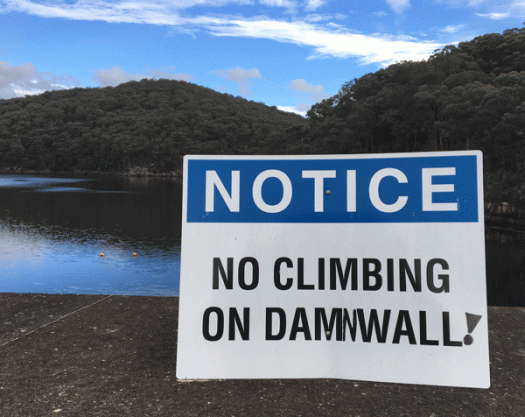
There is something fascinating about dams. I love how they are landscaped with camellias and jacarandas, now gnarly with age, and the vista of water that looks like a lake but isn’t really a lake. I get a little mixed up with the dams around Sydney: I can’t ever quite remember which one has the curved wall, which one has the art deco detailing, which one has the picnic area with the view. But I do know that this notice is on the Avon Dam wall, and that I was rather pleased to see that someone had amended the sign.
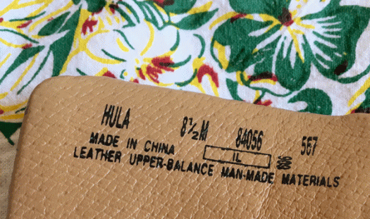
Hula shoes
The first time I went to Hawai’i it came as a revelation that hula was not just the entertainment of Elvis movies, but a deeply meaningful and moving form of storytelling. And the first time I saw hula kahiko, the traditional hula style often performed by men, I was spellbound. The first hula I learnt was the Haleakala Hula, using the split bamboo sticks called pū’ili. I had barely managed to master the steps by the day of the performance, so when our kumu, the magnificent Uluwehi Guerrero, surprised us by playing the accompaniment at lightning speed, I still don’t have any idea how I managed to keep up! It was only when I was throwing out my favourite old shoes, after I had worn them through, that I discovered they were ‘hula’ shoes. Which made me laugh, because of course they would have been no help to me, as there is no such thing. Whatever style of hula, it’s always performed barefoot.
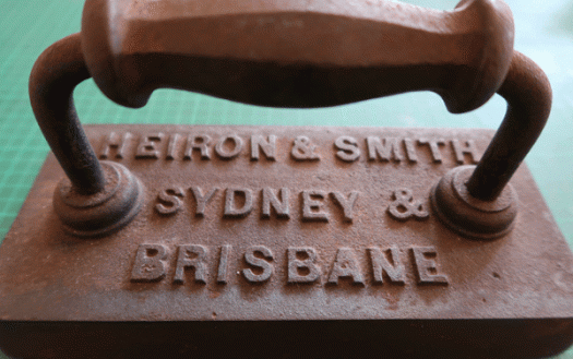
Snooker table iron
This is the bounty that was being protected by that ratty and dusty old cardboard box of Toolite fame and, no surprise, it has become my favourite piece of bookmaking equipment. It’s very heavy, flat, the size of a small book, and has a handle that makes it easy to pick up and move around without squashing your fingers. It’s got that bit of been-around-the-block seen-a-few-things-in-my-time rust, yet the bottom is smooth and clean and shiny so doesn’t mark the paper. Even better, it has type on it.
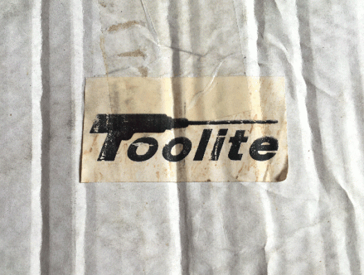
Toolite
I never intended my ‘short break’ to stretch to eleven months, but time has a way of ticking along and space has a way of getting itself filled. Over the last few weeks people have started to ask me what’s going on and if I’m returning to the blog, so if you are reading this, I guess the answer is that I have been successfully prodded. And in the way of all things timely and synchronous, a dusty ratty torn cardboard box came into my possession (the contents of which are for next time) with this most wonderful Toolite label stuck on the side.
I’ll be back
Alphabet City Press is taking a short break, but I’ll be back. I am not an android assassin who has been denied entry into a police station, and therefore I will not be returning by driving a car through the doors to gain access. My return will be a little quieter—just the usual thing that will no doubt involve typography in some way. In the meantime, the DF Commercials clock and the wonderful Bach Script, a recent release from the Mendoza Vergara design studio, will have to suffice.
Wallnuts
I’d like to think that the greengrocer signwriter is in cahoots with the hardware store, or at the very least has a wicked sense of humour, but unfortunately I think that this strategic and quite wonderful spelling mistake is just that—a spelling mistake. I sometimes wonder if ‘interesting’ spellings such as this are ever brought to the attention of the vendors by concerned (and more written-language savvy) members of the public, or if anyone even notices them. Depends where it is I guess. We once had a grocer/deli in the local shopping centre that went to the effort of overhauling their in-store signage. There were so many errors that the customers started writing on the signs and leaving messages, to the extent that the entire new signage was replaced with a couple of weeks of being installed.
Seafood
My husband does most of the food shopping but occasionally, if he is not pressed for time, he lets me tag along. I slow things down because I am sidetracked by packaging, the patterns and shapes of a display, fresh flowers, the rows and rows of deli goods, and the novelty and multitude of the items that we neither need or want. There is a newish grocery store near us that recently provided a much-needed afternoon diversion. We bought broccoli, leeks, bread and strawberries, and along the way I stopped to check out the typography of seafood.
Duke
I’ve seen this pub sign many times before, but on Saturday evening, when my friends and I, replete from a delicious and satisfying dinner, emerged from the chatter and clatter of the restaurant into the buzz and hum of Enmore Road, the drama of the scene caught my attention. The large freestanding letters against the sombre backdrop that swallows up the green light exude a noirish atmosphere that reminds me of Edward Hopper’s painting, Nighthawks, and for a moment, in my imagination, I was transported to that diner.
Protected birds
Well, if there were birds, I certainly saw no sign of them! But perhaps, in the middle of a sunny but cool day in late winter, they were nesting well away from my line of sight. This view captured my attention not just for its message, but for the range of hard surfaces surrounding it, which appear at odds with the imagery you would usually associate with birds—like trees and leaves and branches, materials which have a great deal more inherent suppleness than aluminium, concrete and brick. Also somewhat eyecatching is the use of title case, sometimes referred to as maximal caps. Minimal capitalisation, or sentence case, is more the thing these days. While I guess there’s nothing actually wrong with title case here, it’s just odd and stylistically outmoded. Which really only goes to show that I am not immune to the influence of typographic fashion.
Glebe
I’m usually pretty lucky with parking, but last week I attempted to park in the Broadway carpark at lunchtime, when the novelty of the newly opened food court has obviously not worn off. It’s never the easiest time, but this was the first occasion when I drove round and round, all the way to the top, then round and round, all the way to the exit, without once seeing a vacant spot. Even street parking proved difficult so I had to park some distance away from my destination. The upside, apart from some enforced exercise, was finding a spot next to this exuberant lettering.


![illbeback[c]alphabetcitypress](https://alphabetcitypress.com/wp-content/uploads/2016/10/illbeback.gif?w=525)
![wallnuts[c]alphabetcitypress](https://alphabetcitypress.com/wp-content/uploads/2016/09/wallnuts.gif?w=525)
![seafood[c]alphabetcitypress](https://alphabetcitypress.com/wp-content/uploads/2016/09/seafood.gif?w=525)
![duke[c]alphabetcitypress](https://alphabetcitypress.com/wp-content/uploads/2016/09/duke.gif?w=525)
![protectedbirds[c]alphabetcitypress](https://alphabetcitypress.com/wp-content/uploads/2016/09/protectedbirds.gif?w=525)
![glebe[c]alphabetcitypress](https://alphabetcitypress.com/wp-content/uploads/2016/08/glebe.gif?w=525)