
There’s a lot of visual noise along the stretch of Parramatta Road where this sign is displayed, so the use of yellow on black, while not necessarily sparkling, certainly makes it noticeable.

books • prints • typography • design
There’s a lot of visual noise along the stretch of Parramatta Road where this sign is displayed, so the use of yellow on black, while not necessarily sparkling, certainly makes it noticeable.
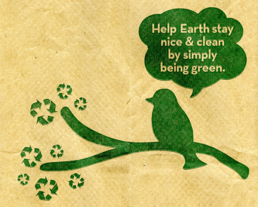
Everyone knows that it is important to have ecological and environmental awareness and responsibility, yet every day we encounter a mess of packaging that is an eyesore and an assault on our aesthetic sensibilities and quality of visual life. Here’s an example of what I consider to be a much more clever and sensitive way of getting a message across. Brown paper packaging, simple one-colour printing, and using a recognised symbol as part of the illustration—resulting in a serious message delivered with lightness. In fact I kept the packaging and brought it home half way around the world in order to re-use it in some way! I’m momigami-ing it and using it in my next artists’ book.
![origamibirds[c]alphabetcitypress](https://alphabetcitypress.com/wp-content/uploads/2015/12/origamibirds.gif?w=525)
This year I went to the Auburn cherry blossom festival for the first time. I suppose it was pretty naive of me, but I thought I was only in for a display of cherry blossoms. I did indeed get that, and they were spectacular, but what I hadn’t accounted for was the hordes of people being shuttle-bussed in, the extensive cultural program, the amazing sight of cosplayers and kimono wearers, and the prepared-for-everything picnickers. Unfortunately I missed the haiku workshop, but I did get to see this impressive tree of origami birds.
![spring[c]alphabetcitypress](https://alphabetcitypress.com/wp-content/uploads/2015/11/spring.gif)
Yesterday I was out and about doing weekend things. Going to the shopping centre and then to the local foreshore park for a late afternoon walk before the storm hit, that sort of thing. Wherever I went I was struck by how vibrant everything looks right now. No doubt it’s the result of a cold winter, some rain, an early heatwave—but the trees seem unusually green and lush, the jacarandas, bougainvilleas and flame trees so vivid in flower, all nudging up against each other to create a dramatic display of strong vibrant colour.
![orangeuketruck[c]alphabetcitypress](https://alphabetcitypress.com/wp-content/uploads/2015/10/orangeuketruck.gif)
The truck was parked there, minding its own business at the back of the Princeville shopping centre, just waiting to have its picture taken! How could I resist? It appeared to be a regular freight truck, not specifically a ukulele carrier—but really, for all I know it could have been a troupadour’s caravan. And it hardly matters. It’s the striking block of orange and the lime green lines and the giant uke that is the attention grabber—an unusual sight even in the land of the ubiquitous four-stringed instrument.
![USeggs[c]alphabetcitypress](https://alphabetcitypress.com/wp-content/uploads/2015/10/useggs.gif)
It’s generally regarded that the colour of an eggshell matches the colour of the chicken that laid it. At home, a carton of eggs rarely contains twelve perfectly matching eggshells, but whenever we have bought eggs from a supermarket in Hawaii, I am astounded by the uniformity of colour, especially those ones that are so perfectly white, not a dot or speckle to be seen. I am confounded by it! I chose these eggs, from Foodland, for two reasons. One, there was just enough variation in their colour to provide me with some reassurance, and two, the ubiquitous branding was a little smudged and unperfect.
![cmyk[c]alphabetcitypress](https://alphabetcitypress.com/wp-content/uploads/2015/08/cmyk.gif)
CMYK stands for Cyan, Magenta, Yellow and Key (or blacK)—the colours that are used in four-colour process printing. Overlapping dots of cyan, magenta, yellow and black produce the full spectrum of reflective colour found in photographs. Colours for type and graphics can be made from combinations of these colours as percentages. For example, 100 percent yellow and 50 percent magenta makes orange, or a mixture of cyan and yellow makes green. In the printing process, the screen for each colour is printed at a different angle to improve print quality and reduce moiré patterns. In book design, a fifth black plate is often used for text, because if the book is published in several languages, only the black text plate needs to be changed.
![jacarandaflame[c]alphabetcitypress](https://alphabetcitypress.com/wp-content/uploads/2014/11/jacarandaflame.gif)
It’s coming to the end of the flowering season, but this year the Illawarra flame trees and the jacarandas have been spectacular. In gardens all around the inner suburbs of Sydney, there are bold splodges of red and purple everywhere, almost too brilliant to believe the colours are natural. It must have been the garden fashion at one time, planting these two specimen trees together. I have a jacaranda in my garden, and for a few weeks every year the tree is covered with vibrant flowers and then the backyard becomes a carpet of purple, buzzing with bees, and we are constantly picking up the flowers that have been traipsed through the house from the yard. Some years ago I worked in an office with a bird’s eye view and, almost overnight, splashes of jacaranda with highlights of flame red would appear, as if someone had wielded a giant paintbrush and daubed the landscape.
![silks[c]alphabetcitypress](https://alphabetcitypress.com/wp-content/uploads/2014/11/silks.gif)
Another year, another Melbourne Cup win! My sophisticated method of choosing the winners—primarily, the colour of the silks—has proved, yet again, to be successful. Racing silk colours are comprised of a set of jacket, sleeve and cap markings. Colours must be registered annually with the relevant racing body, and are subject to a long list of rules including width of stripes, size of chevrons, position of spots. Whatever the rules, it makes for a colourful track. Oh, and my win? The princely sum of $11.
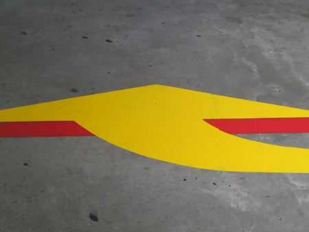
I love red and yellow together. And I love solid blocks of gutsy colour. This arrow, on the smooth grey concrete floor of the parking lot at my local shopping centre, is positively luscious! The dirty grey stops it from having any pretensions of prettiness—another point in its favour—and highlights the unadulterated mass of primary colour. I’ll need to keep my eye on this yellow arrow: for now, the newly applied paint is vibrant and clean, but in a few months it will have been run over by thousands of dirty car tyres and walked on by thousands of pedestrians, so it could get even more interesting.
