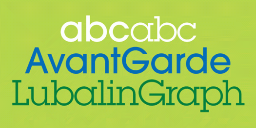
Herb Lubalin, born one hundred years ago, was an American graphic designer and type designer, a founder of ITC, editor of its magazine U&lc, and a Type Directors Club Medal recipient, an award presented to those ‘who have made significant contributions the life, art and craft of typography’. The Herb Lubalin Study Center of Design and Typography at the Cooper Union School of Art was founded in 1985, four years after his death, its focus being to preserve design history through its core collection of Lubalin’s work and extensive archive of design ephemera. Lubalin notably contributed to the design of ITC Avant Garde Gothic and ITC Lubalin Graph. ITC Avant Garde Gothic was based on the logo font, designed by Lubalin, used in Avant Garde magazine. ITC Lubalin Graph was based on ITC Avant Garde but modified to accommodate slab serifs, clearly seen when you look at the typefaces together.
Xmas Pi
Xmas Pi and christmas pie. It’s that time of year again. In my neck of the woods Christmas day will be either blistering hot with a chance of late thunderstorms, or wonderfully mild and raining, a respite from the blistering hot days preceding it. I’m hoping for the relief of a cool day, but whatever the weather we will sit outside and feast on prawns and pudding. Wishing good cheer and happy days to everyone.
Maison
I walked along a different street this morning, and it was a reminder that we don’t have to change much in our daily routine to get an altered perspective. I found plenty of interest in the back lanes my walk incorporated, including this signage, left to take on some character in a way that the front door sign would not be. I wonder if something happened to the O, or if it was just the luck of the draw that on the day the Os were made, the quality of materials was slightly different, or if some other small factor contributed to its future faster deterioration. The typeface looks like a version of Clarendon, which makes me like it even more.
DF Moderns
Today’s Google Doodle celebrates the birthday of Wilbur Lincoln Scoville, the pharmacist who gives his name to the Scoville scale—the scale that measures the hotness of chillies. The thought of hot chilli peppers immediately brought DF Moderns to mind! The Moderns font, designed by David Sagorski, is a collection of dingbats inspired by twentieth century modern art—notably Picasso and Kandinsky—and published by Letraset in 1994. Sagorski’s other fonts include Expressions, Mo Funky Fresh, Bang and Faithful Fly.
Altemus
The Altemus Collection is the work of Robert Altemus, a New York-based designer. It contains around 8000 ornamental and dingbat designs across thirty font families. As well as the character sets you might expect, like Altemus Dingbats and Altemus Borders, there is a slew of alluring others: Birds, Suns, Spirals, Roughcuts, Rays, Pinwheels, Leaves, Kitchen, Toolkit, Pointers and Bursts. Altemus was influenced from everything from Brazilian art deco architecture and 1950s fabric designs to decorative elements found on old packaging at flea markets. What I find so impressive is that the elements of the collection are original, drawn from scratch before being worked up into vector format.
Happy holidays
DF Celebrations was designed in 1994 by Canadian designer and illustrator James Wilson. The collection of woodcut-like dingbats contains a range of festive images for any occasion, including christmas day. Of course there’s nothing to illustrate an Australian christmas, which typically involves the beach, barbecues and prawns! Happy day, wherever you are and whatever you do.
Bruce Lee
Caslon 540
William Caslon was an eighteenth-century English gunsmith, engraver, punchcutter and type designer. His distinctive and legible typefaces transformed English type design by establishing a national typographic style, replacing the previously popular Dutch Baroque types which inspired him. Caslon typefaces have come in and out of fashion over the centuries, and today there are many variations of the original, including Caslon 540, designed by ATF in 1902, whose character set contains this particularly beautiful ampersand.
Blue moon
It’s a blue moon today. Some say a blue moon is the second full moon in a calendar month, others that it is the second full moon in a zodiac sign. If a season has four full moons, the third is called the blue moon. Whichever way you look at it, a blue moon is an additional full moon in relation to a calendar period of time, and it’s significant enough that people write songs about it. The origin of the term remains sketchy, but as good an explanation as any is that it derives from someone, sometime, saying ‘you would argue that the moon is blue’ in the same manner as we would say ‘you would argue that black is white’. There are a few fonts with the name Blue Moon, but this one is by Fonthead Design, and the dingbat is from Eclectics, designed by Pepper Tharp.
Look up
I came across this appealing display typeface during an idle search for the latest releases. Although I design and work with type every day, I’ve never been particularly interested in crafting my own. However, I admire those who do, especially when their work stands out from the predictable mimicking of existing styles. Look Up was designed by Filiz Sahin, who wanted to create ‘a playful font with a home-made feel’ and was ‘inspired by little arrows on websites’.


![maison[c]alphabetcitypress](https://alphabetcitypress.com/wp-content/uploads/2016/08/maison.gif?w=525)
![modernchilli[c]alphabetcitypress](https://alphabetcitypress.com/wp-content/uploads/2016/01/modernchilli.gif?w=525)
![altemus[c]alphabetcitypress](https://alphabetcitypress.com/wp-content/uploads/2016/01/altemus.gif?w=525)
![celebrations[c]alphabetcitypress](https://alphabetcitypress.com/wp-content/uploads/2015/12/celebrations.gif?w=525)
![brucelee[c]alphabetcitypress](https://alphabetcitypress.com/wp-content/uploads/2015/11/brucelee.gif?w=525)
![caslon540[c]alphabetcitypress](https://alphabetcitypress.com/wp-content/uploads/2015/11/caslon540.gif?w=525)
![bluemoon[c]alphabetcitypress](https://alphabetcitypress.com/wp-content/uploads/2015/07/bluemoon.gif?w=525)
![lookup[c]alphabetcitypress](https://alphabetcitypress.com/wp-content/uploads/2015/05/lookup.gif?w=525)