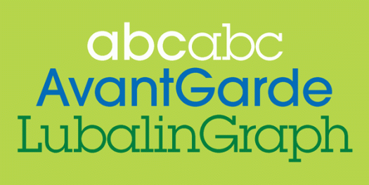
Herb Lubalin, born one hundred years ago, was an American graphic designer and type designer, a founder of ITC, editor of its magazine U&lc, and a Type Directors Club Medal recipient, an award presented to those ‘who have made significant contributions the life, art and craft of typography’. The Herb Lubalin Study Center of Design and Typography at the Cooper Union School of Art was founded in 1985, four years after his death, its focus being to preserve design history through its core collection of Lubalin’s work and extensive archive of design ephemera. Lubalin notably contributed to the design of ITC Avant Garde Gothic and ITC Lubalin Graph. ITC Avant Garde Gothic was based on the logo font, designed by Lubalin, used in Avant Garde magazine. ITC Lubalin Graph was based on ITC Avant Garde but modified to accommodate slab serifs, clearly seen when you look at the typefaces together.
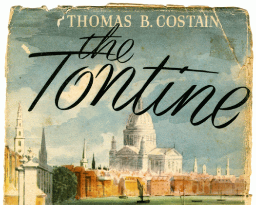
The Tontine
Here is another of those book jackets I was given a while ago. This one appeals to me for its title script—which I’m guessing was done by the illustrator, Herbert Ryman—not only because of its obvious handwritten appearance, but it was published in 1955, long before the proliferation of script fonts. Thomas B Costain was a Canadian journalist, reporter, writer and editor who turned into a bestselling author of historical novels in his 50s. I was quite interested to read about Costain’s life and career, but Herbert Ryman proved even more engaging! He was an artist and illustrator whose considerable body of work includes watercolours of the Californian coast, the wonderful Ringling Brothers Circus posters, designs for attractions at the 1964 New York World’s Fair, and a long association with Walt Disney. He art directed Fantasia and other animated features and drew the first illustrations of the theme park that become Disneyland.
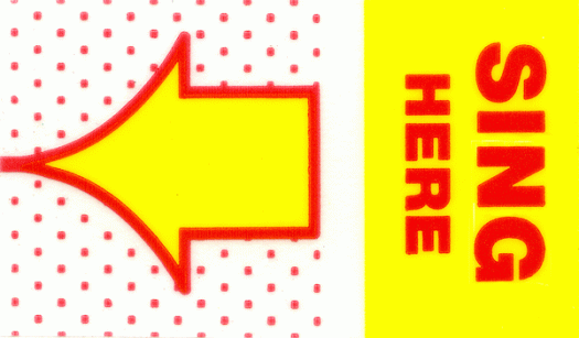
More volume
A big thankyou to everyone who visited my table at Volume 2017 Another Art Book Fair at Artspace in Woolloomooloo this weekend. It was a busy and rewarding three days, and while it was great to show (and even sell!) some of my artists’ books, it was the conversation, interaction and exchange of ideas that made it a worthwhile experience. When I make books I work alone in my studio, and apart from occasionally singing along to whatever music I have playing, I can spend days without saying much. This morning I am hoarse from those hours of chatting, so today I’m planning to sit around and do not much of anything while I segue from loud Volume to daily life volume.
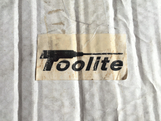
Toolite
I never intended my ‘short break’ to stretch to eleven months, but time has a way of ticking along and space has a way of getting itself filled. Over the last few weeks people have started to ask me what’s going on and if I’m returning to the blog, so if you are reading this, I guess the answer is that I have been successfully prodded. And in the way of all things timely and synchronous, a dusty ratty torn cardboard box came into my possession (the contents of which are for next time) with this most wonderful Toolite label stuck on the side.
Ed Benguiat
Ed Benguiat is prolific. He has designed more than 600 typefaces—Benguiat, Benguiat Gothic, Bookman, Tiffany, Edwardian Script, Souvenir and Bauhaus are just a handful—and played a significant role in the establishment of ITC. Not to mention his hand in a multitude of logotypes—The New York Times, Ford, Readers Digest, AT&T, Estee Lauder, Esquire and countless more. In 1989 he was awarded the TDC Medal, the award from the Type Directors Club presented to those ‘who have made major contributions to the field of typography … and who by their work and talent have shown the value of a heightened awareness of typography in communication’. Before becoming a type designer he played drums in big bands with Stan Kenton and Woody Herman, and despite his stellar design career, he sees himself first and foremost as a jazz percussionist. On the connection between music and design, he has been quoted as saying: ‘Music is nothing more than placing sounds in their proper order so they are pleasing to the ear. What’s a layout? Placing things in their proper order so they are pleasing to the eye.’
Orange truck
The truck was parked there, minding its own business at the back of the Princeville shopping centre, just waiting to have its picture taken! How could I resist? It appeared to be a regular freight truck, not specifically a ukulele carrier—but really, for all I know it could have been a troupadour’s caravan. And it hardly matters. It’s the striking block of orange and the lime green lines and the giant uke that is the attention grabber—an unusual sight even in the land of the ubiquitous four-stringed instrument.
He
I had an email from my friend a couple of days ago. She’s in Tasmania this week, so I was not expecting to hear from her. She had attached a couple of photos of a pub sign, but it was the message itself which was inordinately pleasing: ‘I love how the H has extended a helping hand to the E,’ she says. ‘See what you’ve done to me—photographing typography—I mean, really!’
Alphaspectacles
The side effect of ageing that affects me most is that I now have to don spectacles to be able to read with the sharp focus that I have been lucky enough to enjoy unaided until fairly recently. But I figure that if I’m going to have to wear specs, they might as well be nice ones. Yesterday was my scheduled visit to the optometrist. They’re a friendly and helpful bunch—and given their location, rather used to graphic designers being particular about frames. What made yesterday a standout is that the frames I chose came with free engraving on the underside of the side bit. I’m not big on putting my name or slogans on things, but when they said I could have twenty-six characters …
Hermann Zapf
Hermann Zapf, one of the most significant type designers of the twentieth century, died in Germany this week at the grand age of 96. While some of his typefaces bear his name—Zapf Dingbats, Zapfino, Zapf Chancery—his most famous typefaces are Palatino, Optima and Melior. When he left school in 1933 it was his ambition to be an electrical engineer, but instead he ended up as an apprentice photo retoucher. He became interested in lettering after seeing an exhibition of the work of Rudolph Koch. Using Koch’s book, The art of writing, and Writing and illumination and lettering, a textbook by Edward Johnston, he taught himself calligraphy at home using a broad-edged pen. Print historian Gustav Mori first put him into contact with the D. Stempel AG type foundry and Linotype GmbH in Frankfurt. He designed his first printed type for them in 1938, a fraktur type called Gilgengart. During the course of his career Zapf designed for hot metal, cold type and digital technologies. He was also a cartographer, teacher and book designer.
Look up
I came across this appealing display typeface during an idle search for the latest releases. Although I design and work with type every day, I’ve never been particularly interested in crafting my own. However, I admire those who do, especially when their work stands out from the predictable mimicking of existing styles. Look Up was designed by Filiz Sahin, who wanted to create ‘a playful font with a home-made feel’ and was ‘inspired by little arrows on websites’.


![benguiat[c]alphabetcitypress](https://alphabetcitypress.com/wp-content/uploads/2016/01/benguiat.gif?w=525)
![orangeuketruck[c]alphabetcitypress](https://alphabetcitypress.com/wp-content/uploads/2015/10/orangeuketruck.gif?w=525)
![he[c]alphabetcitypress](https://alphabetcitypress.com/wp-content/uploads/2015/08/he.gif?w=525)
![spex[c]alphabetcitypress](https://alphabetcitypress.com/wp-content/uploads/2015/06/spex.gif?w=525)
![zapf[c]alphabetcitypress](https://alphabetcitypress.com/wp-content/uploads/2015/06/zapf.gif?w=525)
![lookup[c]alphabetcitypress](https://alphabetcitypress.com/wp-content/uploads/2015/05/lookup.gif?w=525)