Even by itself I would like this worn Shelleys drinks sign, painted on the wall of what would undoubtedly have once been a corner milk bar, but what makes it stand out is the addition of the row of red stencilled birds. Who knows whether they mean anything or if they are just some whimsical spur of the moment addition. I suspect that they were embellishments put there by one of a string of proprietors, but whoever it was, they are long gone.
Post office
Government architect Walter Liberty Vernon was responsible for public buildings such as the Mitchell Library, the Art Gallery of NSW, Fisher Library and Central Station — all pretty impressive works. But what I like most is his introduction of the Arts and Craft style to the design of Sydney’s post offices, fire stations and courthouses. Many feature this distinctive and decorative signage style, and Annandale Post Office, build in 1896, has a particularly fine example — well aged and in excellent condition.
Cobargo
Cobargo is a village on the south coast of New South Wales with a population of less than 500 people. It was settled in the 1820s when graziers moved stock into the area and by 1871 there was a school, post office, store, hotel, church and blacksmith shop, and by the 1890s the town even had its own newspaper. A branch of the Bank of New South Wales opened in 1903, and in 1917 operated from its new office on the corner of Bermagui Road until it closed in 1997. The Cobargo streetscape features beautiful turn-of-the-century buildings, many now occupied by local artisans, but it seems most fortuitous that a brewing supplier should occupy the bank building, where they have made excellent use of the existing sign.
Ack
I had not been along the entrance side of this building for quite some time, so it is only recently I saw that the old letters had been replaced by bigger newer brighter ones. I don’t know how the A managed to escape removal, but in my mind I have bestowed it with tenacity and strength of character, a letter determined to hang on at any cost. This is far preferable to viewing it as a victim of neglect! The new C is obviously, and admirably, conspiring to help.
Smokes
Here’s something you don’t see much of these health-conscious no-smoking days. This sign hangs outside what must be the most derelict milk bar in Sydney. The lights are never on and I’ve never seen anyone inside (in fact it’s a little scary) but it opens every day and still has the original booths along the wall and lino on the floor, albeit in disrepair. When the cinema next door was demolished the side wall revealed some original painted advertising, and although that has been covered up again, the smokes and sweets sign remains.
Coffee
Ash
Onomatopoeia is the naming of a thing or action from a sound associated with it. Buzz boom zoom bang crash whippoorwill whisper murmur splash tinkle. I don’t know if there is a word to describe something that looks like itself – a visual onomatopoeia – but I see examples of it everywhere, like this ashy ash. The letters also have a very nice Akzidenz Grotesk feel about them; they’re not a true match to the typeface, but I really like the sound of the name.
Lacklustre
Oh happy day! Typography in action! Early evening, me the designated driver, all of a sudden my passengers exclaiming ‘The u’s dropped! The u’s dropped!’, squeal of tyres, quick u-turn, but oh no – no camera. At least I had my phone, so this momentous event could be recorded and the type tragics could go on their merry way, heads giddy.
Lustre
Lustre, brightness, sparkle, flash, polish. This lettering certainly provides a touch of razzle dazzle to the stretch of otherwise unremarkable industrial shopfronts where it appears. I have driven along the street many times, but have been so beguiled by the promise of what could be so lustrous in nature to warrant this bold sign (in fact it is Lustre-glo, even better!) that it was somewhat disappointing to discover that behind the lavish red L and its companion letters lies a panelbeating shop.
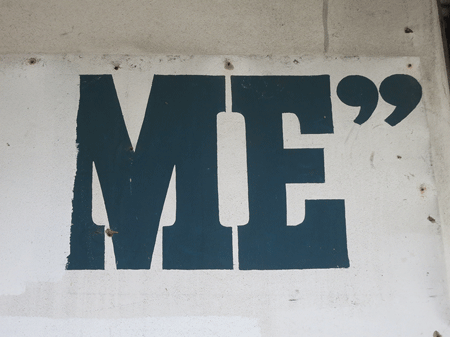
Me
This is all that’s left of a painted sign on the side of a building in Redfern: the rest has been roughly painted out with a roller, but well enough that you can’t read what’s underneath. The most recent occupant of the building was a dry cleaner who had a metal sign affixed to the wall, but now they have gone and taken their sign with them, revealing this relic of an earlier time. I doubt it was their intention, but it looks like they had a sense of humour and purposely left just enough unobscured lettering to pique the curiosity of people like, ahem, me!

![birds[c]alphabetcitypress](https://alphabetcitypress.com/wp-content/uploads/2013/03/birds.gif?w=525)
![post[c]alphabetcitypress](https://alphabetcitypress.com/wp-content/uploads/2013/03/post.gif?w=525)
![ales[c]alphabetcitypress](https://alphabetcitypress.com/wp-content/uploads/2013/02/ales.gif?w=525)
![ack[c]alphabetcitypress](https://alphabetcitypress.com/wp-content/uploads/2013/01/ack.gif?w=525)
![smokes[c]alphabetcitypress](https://alphabetcitypress.com/wp-content/uploads/2013/01/smokes.gif?w=525)
![coffee[c]alphabetcitypress](https://alphabetcitypress.com/wp-content/uploads/2013/01/coffee.gif?w=525)
![ash[c]alphabetcitypress](https://alphabetcitypress.com/wp-content/uploads/2012/12/ash.gif?w=525)
![lacklustre[c]alphabetcitypress](https://alphabetcitypress.com/wp-content/uploads/2012/12/lacklustre.gif?w=525)
![lustre[c]alphabetcitypress](https://alphabetcitypress.com/wp-content/uploads/2012/12/lustre.gif?w=525)
