The Dean’s Watch

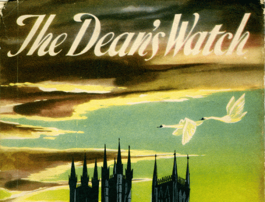
A dozen or so tattered dust jackets have come into my possession. I have never heard of any of the books, but it hardly matters. The illustrations are evocative and dramatic, and while the title typography is different on each of them, they can certainly be recognised as a style. I googled The Dean’s Watch, and discovered that it is a novel written in 1960 and set in England, and the general consensus is that it’s a pretty good read. The book didn’t accompany this jacket, so I won’t be reading the story any time soon, but I have a plan for these tattered discards that involves making my own books using the imagery that is really just too good to waste.

Glebe

glebe[c]alphabetcitypress

I’m usually pretty lucky with parking, but last week I attempted to park in the Broadway carpark at lunchtime, when the novelty of the newly opened food court has obviously not worn off. It’s never the easiest time, but this was the first occasion when I drove round and round, all the way to the top, then round and round, all the way to the exit, without once seeing a vacant spot. Even street parking proved difficult so I had to park some distance away from my destination. The upside, apart from some enforced exercise, was finding a spot next to this exuberant lettering.

Hawaiian music

himusic[c]alphabetcitypress

If you were to visit my house or ride in my car, you might wonder if there was any music other than Hawaiian music. (Is there?) We have an eclectic collection of music, but it’s the slack key guitar records that are on high rotation. I’m not quite sure how it all started, but the seeds were sown even before we set foot on Hawaiian soil for the first time, even before we heard The Descendents soundtrack. This handpainted sign is in Kapaa.

Chips

chips[c]alphabetcitypress

It’s unseasonably hot, an October long weekend Indian summer. The beaches and pools are going to be crowded today, but I’m staying in the cool indoors, safe from the throngs. Days like today, the smell of chips emanates from every seaside kiosk, an unpleasant aroma unless you are the one eating the chips, in which case you are immune to the malodorous deep-frying fat. The chips on offer here are a little removed from the beach, though. I like the hand-drawn writing, outlined in gold, set within the bounds of those colourful lilac and yellow lines.

Goldenia

goldenia[c]alphabetcitypress

There is a swag of books documenting the faded glory of painted advertising, and you can understand why. Hand-painted words on a brick wall have a quality (especially as they change with time) that can’t be attained with today’s digital renderings. Goldenia Tea contained ‘nothing but the tender young leaf’, according to an advertisement in The Sydney Morning Herald in 1931. The lettering portrays a feeling of solidity and reassurance—which, given the era in which the tea was produced, I’m sure was the intention—and the swishes on the G and a transform it into something special.

W.F

wf[c]alphabetcitypress

In proofreading, w.f. stands for ‘wrong font’, but that can hardly be applied here, even though my pavlovian response is to look for where to make the correction! Every country town most certainly has its butcher, baker and candlestick maker, but the kind of store I gravitate towards is the double-fronted outfitters—women’s clothes on one side, men’s on the other, recessed doorway in the middle allowing maximum window shopping. This clothing store was even wider, with four windows and two doors, and the vignetted, gold-outlined signage appeared twice. The letter shapes were almost the same but not quite, and I particularly liked this F, which was much more elongated than its counterpart above the other doorway.

Real

real[c]alphabetcitypress

There’s something a little wonky going on with this lettering. The letter shapes are not quite right: the thickness of the strokes varies, the middle stroke of the E juts out a tad longer than the bottom stroke, the leg of the R doesn’t quite support the bowl. The kerning would benefit from some fine-tuning too. But the letters have character—no pun intended, although perhaps I should say they have personality! I like this carefully painted but not perfect gold and red word—perhaps for the very reason that it isn’t perfect—as well as its reflection in the building across the road.

Red no

redno[c]alphabetcitypress

I doubt the painters planned it so the NO would be neatly contained within the lines, and I know for certain that they hadn’t planned for me to come along and comment on it. My guess is that the ‘no’—of ‘no parking’, in the supermarket carpark—was painted at the appropriate height on the brick wall, and it was happenstance that the rails of the trolley return bay matched so well. Either way, this co-incidence of placement, combined with the steely grey piping and the white concrete-block wall, result in a picture of graphic texture and colour which I found most pleasing.

Dooleys store

ptyltd[c]alphabetcitypress

I found this above the door of the general store in the small NSW town of Murrurundi. The J Dooley & Co Ltd store was opened in 1901, and the sign above the door is original, although it looks like the PTY was added later, given the spacing and typographic mismatch. It’s not just the letter shapes that indicate the age: the punctuation and superscript used here out of fashion these days, and say as much about the era as the typeface.

Baker

baker[c]alphabetcitypress

There are some reassuring certainties in life, one of them being that every small Australian town has a butcher, a baker and a candlestick maker. In modern times the candlestick maker might come in another guise, but there is always something to fit the bill. Admittedly, I haven’t been to every small Australian town, but I have most assuredly observed this rub-a-dub-dub trio theme. This baker exuded that irresistible smell of freshly baked bread, made an excellent cup of coffee, and displayed a decent bit of lettering to boot.