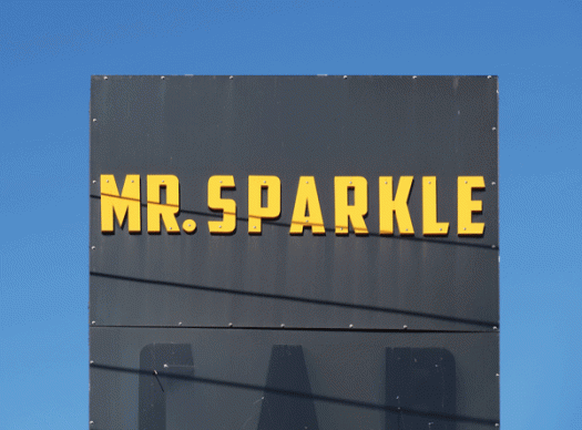
There’s a lot of visual noise along the stretch of Parramatta Road where this sign is displayed, so the use of yellow on black, while not necessarily sparkling, certainly makes it noticeable.

books • prints • typography • design
There’s a lot of visual noise along the stretch of Parramatta Road where this sign is displayed, so the use of yellow on black, while not necessarily sparkling, certainly makes it noticeable.
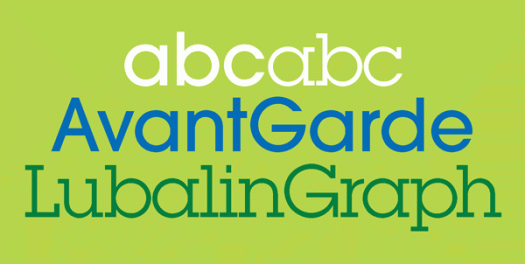
Herb Lubalin, born one hundred years ago, was an American graphic designer and type designer, a founder of ITC, editor of its magazine U&lc, and a Type Directors Club Medal recipient, an award presented to those ‘who have made significant contributions the life, art and craft of typography’. The Herb Lubalin Study Center of Design and Typography at the Cooper Union School of Art was founded in 1985, four years after his death, its focus being to preserve design history through its core collection of Lubalin’s work and extensive archive of design ephemera. Lubalin notably contributed to the design of ITC Avant Garde Gothic and ITC Lubalin Graph. ITC Avant Garde Gothic was based on the logo font, designed by Lubalin, used in Avant Garde magazine. ITC Lubalin Graph was based on ITC Avant Garde but modified to accommodate slab serifs, clearly seen when you look at the typefaces together.
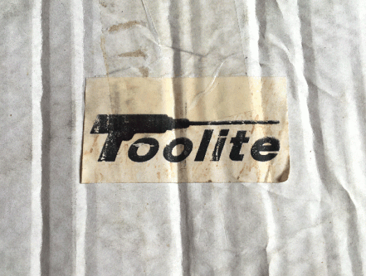
I never intended my ‘short break’ to stretch to eleven months, but time has a way of ticking along and space has a way of getting itself filled. Over the last few weeks people have started to ask me what’s going on and if I’m returning to the blog, so if you are reading this, I guess the answer is that I have been successfully prodded. And in the way of all things timely and synchronous, a dusty ratty torn cardboard box came into my possession (the contents of which are for next time) with this most wonderful Toolite label stuck on the side.
![gardenisland[c]alphabetcitypress](https://alphabetcitypress.com/wp-content/uploads/2015/08/gardenisland.gif)
For a minute or so I was filled with hope that there might be a publishing industry on Kauai—the garden island referred to here—but the building houses an Italian cafe. However, the local newspaper is called The Garden Island and is housed in a newer building across the road, so I would guess that, when the newspaper was first published in 1902, it started its life here. I like the incised sans serif lettering, stark and graphic in the afternoon light.
![signal[c]alphabetcitypress](https://alphabetcitypress.com/wp-content/uploads/2015/01/signal.gif)
My imagination ran riot when I saw that the Signal Hotel in Werris Creek was for sale. Eighteen bedrooms plus an additional manager’s residence, close to transport and shops, the darkly romantic Mount Terrible in the distance, and only four hours from Sydney. All this and more (!), but what I really wanted was ownership of this fabulous sans serif signal, stark in the harsh afternoon sun, white-on-white with a drop shadow and half broken just so, as if a designer had already got to it.
![fuel[c]alphabetcitypress](https://alphabetcitypress.com/wp-content/uploads/2015/01/fuel.gif)
Straight to the point! None of this diesel or ethanol or super or standard or vortex or 95 or 98 or lpg or 4c-off-with-voucher business. Just fuel. I love this no nonsense declaration, with its rusty streaks and bold red sans serif letters. In the country town, where I saw this, the message is unmistakable, but location plays a big part in its inherent communication. In the city, this could equally be a cafe, an overpriced grocer, an industrial-chic hangout for the weekend chillseeker, and the asymmetric shape would be interpreted as organic rather than aged and weathered.
![regent[c]alphabetcitypress](https://alphabetcitypress.com/wp-content/uploads/2014/10/regent.gif)
This signwritten Regent is not exactly the same as the digital font version, but there’s no mistaking the striking likeness to the Broadway font family. The shadowy vertical type of the unlit neon sign, perhaps more recent than the painted counterpart, is Broadway Engraved. Broadway, a decorative Art Deco typeface, was originally designed in 1927 by Morris Fuller Benton for American Type Founders.
![morning[c]alphabetcitypress](https://alphabetcitypress.com/wp-content/uploads/2014/07/morning.gif)
Late afternoon, actually, sun low in the sky, that transformed this very ordinary dry-cleaner’s window into something a little more eye-catching. What first attracted me was a reflected ‘yes’ (you can just see the Y in the upper right corner), but here, I like how the strength of the afternoon sun has thrown the shadow of the writing on the window into such sharp relief, and that the angle of the sun has slightly distorted and skewed the letter shapes. The typeface is Arial—most easily distinguished from Helvetica by the shape of the arm on the r.
![greenf[c]alphabetcitypress](https://alphabetcitypress.com/wp-content/uploads/2014/06/greenf.gif)
The alphabet is everywhere, including in the garden, although not mine. My garden doesn’t look anything like this! My garden is neglected and untidy—although far from unloved—and struggling to recover from the crazy strong winds earlier this week that have turned everything so dry, making a mockery of the torrential rain we had only a couple of weeks ago. Now, things are brittle to the touch and everything in my world is a potential source of static electricity. Alphabet topiary is always Helvetica-like: who would be obsessive enough to tame a hedge into a serif letterform!
![posthere[c]alphabetcitypress](https://alphabetcitypress.com/wp-content/uploads/2013/12/posthere.gif)
There’s not much time left to get your letter to Santa. These days you can submit an online letter and get an instant reply, but that’s just not the same as pen and paper. Australia Post provides instructions whichever way you want to do it, including how to address the envelope (North Pole, postcode 9999, plus, wouldn’t you know it, a 60 cent stamp), and if you live in Australia they promise they will reply. In the United States, USPS has been officially involved with Santa mail since 1912, when Postmaster General Frank Hitchcock authorised postal employees to reply to the letters. In New York, ‘Operation Santa’ responds to more than half a million letters each year. You could post your Santa letter here, in this red pillar box that has been in use in NSW for more than a hundred years. The hinge is showing some wear and tear but the instruction is as clear as ever. Although the typeface looks very much like Trade Gothic, it isn’t: Trade Gothic was designed in 1948, years after this postbox was made. Amazingly, if Australia Post imposed its current sans serif font of choice, Univers, over this century old type style, it wouldn’t look very different.
