Lustre, brightness, sparkle, flash, polish. This lettering certainly provides a touch of razzle dazzle to the stretch of otherwise unremarkable industrial shopfronts where it appears. I have driven along the street many times, but have been so beguiled by the promise of what could be so lustrous in nature to warrant this bold sign (in fact it is Lustre-glo, even better!) that it was somewhat disappointing to discover that behind the lavish red L and its companion letters lies a panelbeating shop.
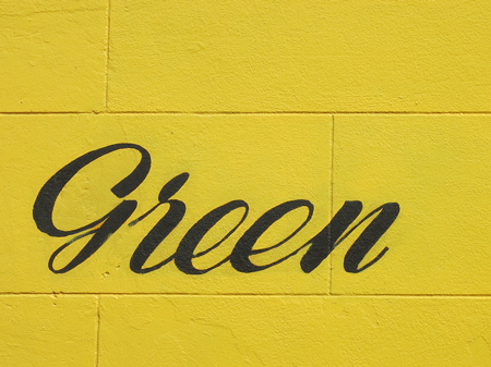
Green
This black on yellow green does exist with other words adjoining it, thereby conveying a more prosaic meaning, but in the first few moments of seeing it I allowed myself to imagine it was the signwriter’s ironic sensibility at play, his inner surrealist let loose. It is a commonly held belief that Mondrian hated green but hopefully he wouldn’t have been offended in this instance!
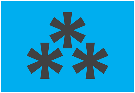
Asterism
In typography, an asterism is a symbol consisting of three asterisks placed in a triangle. Its function is to denote a break in the text; a break that is more than a paragraph, less than a chapter. Breaking text in this way is commonplace, but the use of the asterism to indicate it is rare. More prevalent is the use of a line space or a single asterisk. Or a dinkus, but that’s for another day.
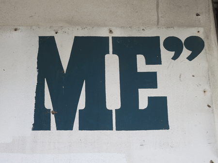
Me
This is all that’s left of a painted sign on the side of a building in Redfern: the rest has been roughly painted out with a roller, but well enough that you can’t read what’s underneath. The most recent occupant of the building was a dry cleaner who had a metal sign affixed to the wall, but now they have gone and taken their sign with them, revealing this relic of an earlier time. I doubt it was their intention, but it looks like they had a sense of humour and purposely left just enough unobscured lettering to pique the curiosity of people like, ahem, me!
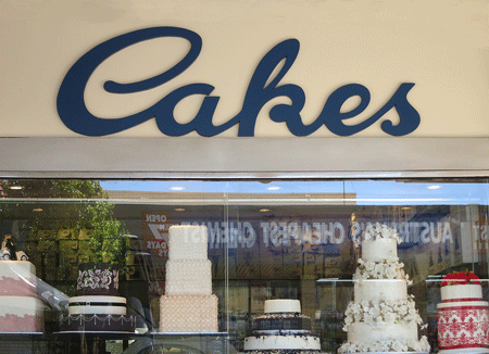
Cakes
Angelo Mezzapica’s ‘Continental Cake Shop’ on Norton Street opened in 1952 and it didn’t take long before it was considered the only place to go for Italian cakes, biscuits and pastries. I don’t know if the sign is as old as the shop but it’s been there as long as I can remember. The window display is always pretty interesting, especially around holidays when the theme-decorated cakes are humorous and imaginative. Angelo retired about 30 years ago but the cake shop has stayed in the family and retained its excellent reputation. For good reason: they make the best rum balls in the Inner West.
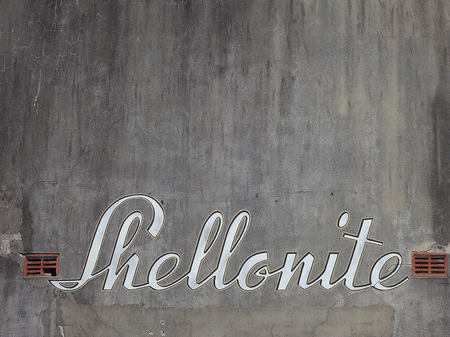
Shellonite
It’s funny how you can traverse the same streets countless times and then one day see something you’ve never seen before. I saw this sign for the first time last week above the doorway of a converted factory on a back street I often take to avoid traffic. All I’ve been able to discover about Shellonite is that it was registered as a trademark in Australia in 1930 and manufactured artificial amber, horn and resin. Very little evidence of their existence remains but it’s nice to see that whoever renovated the building decided to keep the sign.
Gotham
Gotham is a family of sans serif typefaces designed by Tobias Frere-Jones. It’s hardly surprising that I find it so aesthetically pleasing given that its letterforms are inspired by New York signage, New York and signage being two things I’m kind of obsessed with. My first brush with Gotham came a few years ago when I was designing some books for Jamie Durie Publishing, but more famous examples of its use are on the cornerstone of the One World Trade Center and as the typeface of choice for Barack Obama’s presidential campaign material. I read an article in The New York Times that noted that ‘every element of [Obama’s] visual identity has been masterfully conceived and executed to depict [him] as perfect presidential material’. So, does a typeface a president make? Obviously there is more to it than that, but there is no doubt we have a typeface of our time, a president of our time, and we can all breathe a huge sigh of relief.
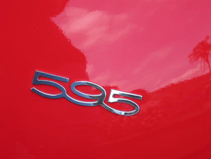
Fiat
Last weekend my local neighbourhood held its annual Italian street fair. It was full of the usual food stalls, pasta displays and trinkets. Oh, and more food stalls. I made my way to the very end and was rewarded with the sight of two rows of shiny vintage Fiats, every one of them so obviously loved and cared for. This one was polished to within an inch of its life, but the main attraction, apart from the painterly effect of the reflection, is the very typographically stylish number.
Beetroot
O, Futura
Awful Futura, fabulous Futura. I will use almost any other typeface before I will resort to Futura! It is over-used, ill-used, thoughtlessly used. And yet its alphabet contains some perfect letter forms and when used appropriately and wisely it is stylish beyond measure. It elicits such a reaction from me because I have had to use it too often, particularly in school textbooks where the ‘a’ most closely matches the ‘a’ of the Foundation Style method that’s used to teach kids to write. Upper case Futura looks great and lower case works well for headings, but to me it reads badly as body text, and therein lies the rub.

![lustre[c]alphabetcitypress](https://alphabetcitypress.com/wp-content/uploads/2012/12/lustre.gif?w=525)
